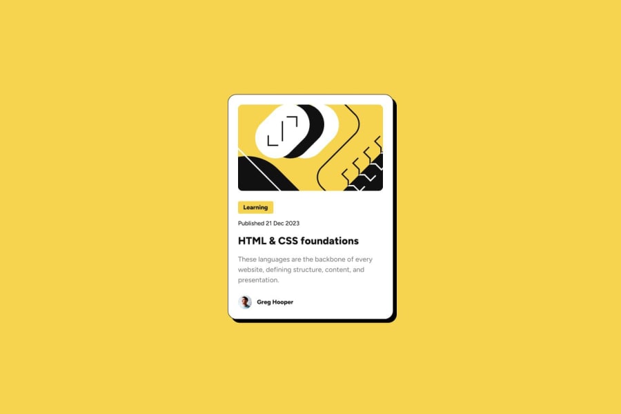
Design comparison
Solution retrospective
...made with a lot of love 🤘🏻🙂
Community feedback
- P@mauLoveraPosted 11 months ago
Hey this is a great looking solution! I did notice that one of the hover states is missing though. When hovering over the blog header, the card's drop shadow should extend from 8px x&y to 16px x&y. Hope this helps!
Marked as helpful2 - P@dantheuriPosted over 1 year ago
Wow. Pixel-perfect !!! Do you have access to the figma files ?
21@CheospherePosted about 1 year ago@dantheuri17 Thank you very much for your comment. I don't have access to figma, because my account is free.
5@CaioQuerinoPosted about 1 year ago@Cheosphere Mine was big, but only because I forgot to select the general properties of the page (*)
1 - @coding-stockPosted over 1 year ago
My God! it's perfect, i wonder if i will ever reach here , how long have you been programming if you don't mind me asking
13 - @MichaelGee76Posted over 1 year ago
I'm thrilled man. Pixel perfect design. Great work
4 - P@onlydominikPosted about 1 year ago
Hi, I'm looking at your work and it really is pixel accurate. And I'm just wondering what's next when it comes to responsiveness. I see that you have a lot of things like container etc. set rigidly in px. Do you do this only in the projects on this website or in general?
2@CheospherePosted about 1 year ago@onlydominik Thank you very much for your comment. In each project I try to apply the best possible criteria regarding the most appropriate unit of measurement to use, whether pixels, percentages, rem, em or some other unit of measurement.
2 - @Randall3475Posted over 1 year ago
Hello!
How do you make these pixel perfect? I follow every value provided in the Figma file, but in the end it's still not pixel perfect.
What's your secret?
Thanks!
2@CheospherePosted over 1 year agoHello @Randall3475, I have some knowledge of graphic design, what I do is carefully examine the "desktop-design.jpg" file, using photoshop or illustrator, so I can measure the sizes, margins and padding of each element, and apply it to my development to achieve a result almost identical to the UI design that they give us in the project files folder. It's a bit stressful and time-consuming work, but I like seeing the end result.
11@fabiot2Posted over 1 year ago@Cheosphere no way im ussing adobe xd and still have errors
3 - @hashmi7917Posted over 1 year ago
apple designer is looking for you bro, what a amazing work perfect. one more request kindly share your learning resources and tips and tricks to follow or any learning path would be helpfull ;)
2 - @ridhonurbagjagPosted 11 months ago
Wow! that is great one!
It is amazing how accurate your solution to the challenge design. Even with the figma starter pack, I am unable to create exactly like that. cheers to you!
1 - @Dago04Posted about 1 year ago
Excelente diseño me encanto ♥
1@Dago04Posted about 1 year ago@Cheosphere para eso estamos. gracias por darle corazón a mis proyectos también♥
1 - @Iggy19944Posted about 1 year ago
Looks great as expected! P.S Thank you for reviewing my projects :)
1 - @Mazz100Posted over 1 year ago
GREAT WORK!!: I always since I started on FEM, trying to pixel-perfect match every project. I don't have access to PRO for Figma files but I saw your reply on using PS to analyze image canvas and size, I am familiar with adobe apps so if you have any tricks you using in photoshop I will gladly take it.
1 - @RedenedPosted 12 months ago
Hello, exquisite solution, very well done.
May i ask how did you get the design and solution screenshots to be identical?
I've tried to do what you have done (I tried to copy the design screenshot pixel by pixel), but for some reason my solution looks smaller than the design in the comparison with the design when i uploaded it.
Cheers.
0
Please log in to post a comment
Log in with GitHubJoin our Discord community
Join thousands of Frontend Mentor community members taking the challenges, sharing resources, helping each other, and chatting about all things front-end!
Join our Discord
