
gurpal-dev
@gurpal-devAll solutions
- Submitted 3 months ago
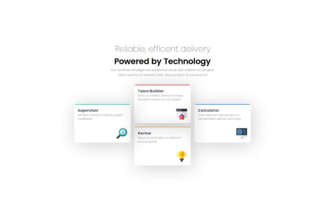
Four Card Feature Section
- HTML
- CSS
I want to know that why do only the calculator element is squeezed when the screen sizes decreases while others don't shrink. I couldn't figure that out.
- Submitted 3 months ago
Single Price Grid Component
- HTML
- CSS
I really want to know more ways of increasing responsivity. How can the font-size be made more adapt to the changes of resolution?
- Submitted 3 months ago
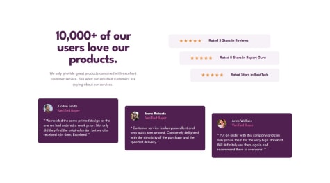
Social Proof Section
- HTML
- CSS
On the right side, the three rating container (which includes 5 stars and names rated by) have to be indented from the left side and outdented from the right side. I managed to create indentation on the left side by give margin property, but on the right side it supposed to outdented but rather the container got shrunk. As a result, it failed to create the same design given in the challenge. I would really appreciate help if someone could help.
- Submitted 3 months ago
Chat App CSS Illustration
- HTML
- CSS
I have problems with responsivity. Some elements look funky when screen size changes. For some reasons there is space at the bottom and right side. I'm not sure if it is causing by the pseudo element that I used for background design. Can elements with
position: absolute:cause overflow?I would appreciate help with the hero. I think it was only decorative, but for practice I gave it input and button elements.
And my biggest challenge was to keep the size of phone in the design to small, but I think I failed terribly since it is big and causing overflow vertically. I still don't know what is causing horizontal overflow. Please help me understand that!
- Submitted 3 months ago
Fylo Data Storage Component
- HTML
- CSS
There's plenty wrong with my project.
Responsivity - There are mainly two containers in this project: one for the logo and icons (which I name fylo-container), and other for the text, progress-bar, labeling and dialogue box that shows the data(storage-container). The storage-container has to be wider than the fylo-container as it is in the given design. For some unknown reasons,
max-width: ;property is not working, although thewidth: ;property works finely. But thewidth: ;property doesn't make the element responsive as it is fixed width. I have checked many times and tried to figure out the problem myself so many times but to no avail. I end up being frustrated. I would really appreciate help with this. - Submitted 3 months ago
Testimonials Grid Section
- HTML
- CSS
I want a feedback on HTML semantics and on CSS in general. I want to know how others set the body to achieve the position of elements in center. I want to know why when I use
body{ height: 100%; }doesn't add the padding at the bottom when it is given (to give space on the top and bottom as it is given in the design), but when the padding is given at the top, it adds to the top without any problem.However, when I use
body { min-height: 100%/vh; }. It does add padding to the top and bottom without a problem. - Submitted 3 months ago
3-Column Preview Card Component
- HTML
- CSS
I want help with card's position on mobile screen. On the mobile screen, in the design the card has space on all four sides. I gave margin properties to the card to give space on the left and right, but it didn't work for the top and bottom. If the margin is given on the top and bottom, it only shows on the top and ignores the bottom side. ** I would really appreciate if someone help to solve the problem**.
And also I would really appreciate a review on my HTML and CSS. And suggestions to improve it.
- Submitted 3 months ago
Profile Card Component
- HTML
- CSS
I want to know how else those background pattern be placed. I used pseudo elements on the main "parent" which encapsulate all other elements.
- Submitted 3 months ago
Stats Preview Card Component
- HTML
- CSS
Please help me with responsivity. It's so confusing. How to make everything shrink according to the various screen sizes?
- Submitted 3 months ago
NFT Preview Card Component
- HTML
- CSS
I want a strong feedback on HTML semantics and want to know whether my project is neat or not. I would really appreciate if someone helps me remove the redundancy if there is any.
- Submitted 3 months ago
Results Summary Component
- HTML
- CSS
I want help with element's width and its children's width. Like how can i stop elements basing their width on children's width.
In this project, I wanted to assign the width of the paragraph individual to its parent element but somehow it's not happening. If i change the width of the paragraph, the card element which is holding everything inside bases its width on it. How can I modify the paragraph's length independent of its parent's width?
By the way, I'm using the free version. So I'm just guessing the measurement of elements.
- Submitted 3 months ago
Product Preview Card Component
- HTML
- CSS
I want help with responsiveness. I want to know whether I should go first for the mobile or desktop.
No matter what I do, I could not accomplish exactly the same design as the given challenge. The main problem I faced is the sizing. I can easily replicate the same design for the desktop, but when it comes to mobile the things do not match exactly.
I really need feedback!
- Submitted 3 months ago
Social Links Profile
- HTML
- CSS
I would appreciate feedback on the layout and html semantics.
- Submitted 3 months ago
Recipe Page
- HTML
- CSS
Q. How to divide the content properly? Q. What is the best way of modifying content?
- Submitted 3 months ago
Blog Preview Card
- HTML
- CSS
I would like to know more about setting the width of the content and how to make it responsive.