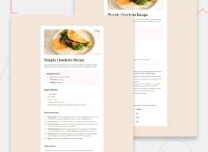
Design comparison
Solution retrospective
I'm happy that I did this challenge. Next time, I will try to spend some time to do thorough analysis of the Webpage and try to visualize what tags and where they can be used to keep the semantics intact. I also realized later that I forgot to put accessibility tags. Next time, I will create a note and will write down all the essentials before jumping in directly. So that I don't forget.
What challenges did you encounter, and how did you overcome them?My biggest challenge was the layout. I spent a lot of time figuring out how and where the things will go. I tried dividing content into sections, mainly three sections and then each section has a element which holds everything in a particular section. This way, it makes work easy and I was sort of relieved that in each section I was only paying attention to certain content rather than all of the content at once.
I also got confused when writing custom properties. I'm still finding out what names I can use to naming the common properties like font-sizes, font-color and font-weight. I need something that I can use in any project without needing to modify it every time, something consistent reusable.
Another problem I came across during this project was that there was inconsistency. The fonts, color, sizes and weightage were all different. I was struggling with the ideas that whether I should target them individually through classes or I should make utility classes and then do the modification where it is required. I was confused and used the combination of both.
What specific areas of your project would you like help with?Q. How to divide the content properly? Q. What is the best way of modifying content?
Community feedback
Please log in to post a comment
Log in with GitHubJoin our Discord community
Join thousands of Frontend Mentor community members taking the challenges, sharing resources, helping each other, and chatting about all things front-end!
Join our Discord
