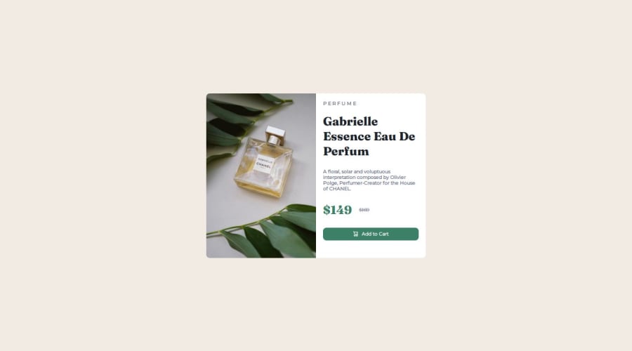


Design comparison

Solution retrospective
I'm happy that I've done this challenge.
What challenges did you encounter, and how did you overcome them?I faced the challenge of html semantics, layout and responsiveness.
I messed up the layout by not encapsulating the entire content into one parent container. I was trying to do it individually like having all content in two container and then trying to match their sizes. However, it turned out to be a huge problem. No matter what i do, the sizing won't match because of the content. Then after, thinking about the problem a lot I somehow came across the idea of putting everything into one container and inside that container I can give the two main containers that divide the whole content into two sections, properties of width: 100%. It did solve the problem of sizing.
What specific areas of your project would you like help with?I want help with responsiveness. I want to know whether I should go first for the mobile or desktop.
No matter what I do, I could not accomplish exactly the same design as the given challenge. The main problem I faced is the sizing. I can easily replicate the same design for the desktop, but when it comes to mobile the things do not match exactly.
I really need feedback!
Community feedback
Please log in to post a comment
Log in with GitHub
Join our Discord community
Join thousands of Frontend Mentor community members taking the challenges, sharing resources, helping each other, and chatting about all things front-end!
Join our Discord