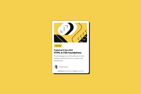
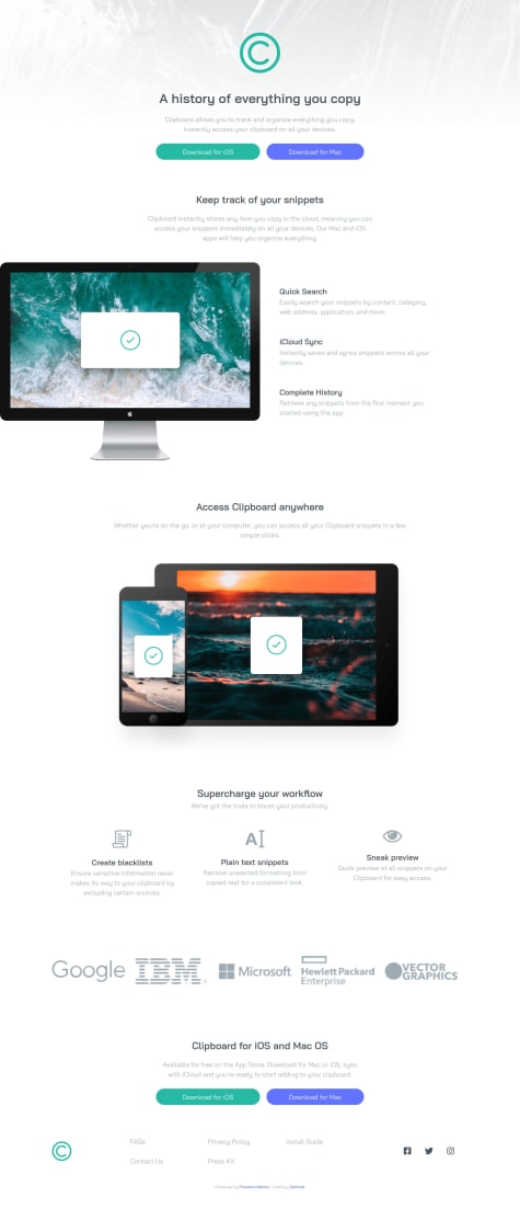
Not Found
Not Found
Not Found
Not Found
Not Found
Not Found
Not Found
Not Found
Not Found
Not Found
Not Found
Not Found
Not Found
Not Found
Not Found
Not Found
Not Found
Not Found
Not Found
Not Found

All comments

  • @jaysonalfie

    Submitted

    What are you most proud of, and what would you do differently next time?

    Well I am happy that I get to expose myself to frontend development and that I learnt more about media queries when it comes to responsive design

    What challenges did you encounter, and how did you overcome them?

    Well still the validation aspect and doubt and also thinking too much but I know that I can do this and that I will get there.

    What specific areas of your project would you like help with?

    Well just learning more and more of CSS just to have a grasp when it comes to styling.

    Kelvin 770

    @githukelvin

    Posted

    Hey buddy congrats on the second solution. So the project is greater though stop using height setting height: 539px; in your code let the layout and margins and paddings set the height of your components happy coding buddy

    0
  • Kelvin 770

    @githukelvin

    Posted

    Though I haven't finished the logic, I deployed the frontend. I will update the logic updated later today. Happy Coding guys

    0
  • @nicky1707

    Submitted

    I got css property overrinding problem ( css property crossed out ) it took me some time to understand it. What is the best practice to avoid it.

    Kelvin 770

    @githukelvin

    Posted

    Hello there,

    you could just use margin:10rem auto;

    0
  • Kelvin 770

    @githukelvin

    Posted

    Hello @kiruanime2003

    Congrats on This

    You could just add some font-size on the heading and just add some margin-top to the button.

    Also add border-radius:on the button.

    ***Happy coding ***

    1
  • Kelvin 770

    @githukelvin

    Posted

    Hey @JulienK94

    Some feedbacks here you design upto the requirement i like 😉

    Just some lookouts

    Add line-height:1.5; on your paragraph after the bold heading.

    Add letter-spacing on the preview text

    Finally add font-size: on you heading i mean Gabrielle .....

    Happy coding buddy .Hope it helpful

    Marked as helpful

    0
  • Kelvin 770

    @githukelvin

    Posted

    Hey buddy

    Seen you havent updated the screenshot of preview

    • The margin: 5rem auto 0 auto; you can replace with margin:10rem auto; it will be exact of that of design.and that it is if you have added max-width:1440px; on the body.

    -Another feedback is the paragraph should have a font-weight:500; font-family:montserrat,sans serif. add line-height:1.5; add width:80%;

    -Another point is <main class="container"> you could have used div instead of the landmark. add alt="" on your cart image accesibility respect heading from <h1></h1> to <h6></h6 in that order.

    Thats all @afaiz-space Happy coding Hope it is Helpful

    2
  • Kelvin 770

    @githukelvin

    Posted

    Hi @dnper

    I just wanted to give you some hits to make the solution

    -body .container This is the class you used you can remove margin-top: 50px; margin-left: 20%; replace it with margin:10rem auto ; to center your container. -Add some landmarks on your website <header></header> <main></main> <footer></footer> this is for accesibility.

    --Cart image should be white.

    Happy coding

    Marked as helpful

    1
  • Kelvin 770

    @githukelvin

    Posted

    Hi @Darhniel, -I want to give you some lookouts here

    -First you must add Landmarks in you file

    -header main footer will help you remove some of the accessibility issues

    -On html you could try looking each part of the design n treat it like sections eg Keep track till access clipboard that part above can be on of section and part above

    `keep track`  with buttons and  history   can be a ```section```
    
    0
  • Kelvin 770

    @githukelvin

    Posted

    @AbdurRaheemC

    You can use Grid display. Then use grid-template-columns:1fr 1fr; use that on 1440px

    Then on mobile use

           - `Grid-template-columns:1fr;`  add
    
           -`grid-template-rows:1fr 1fr;`
    

    that will make you project look good and responsive.

    Happy coding Hope you find it helpful

    0
  • @grgrocky

    Submitted

    The most challenging is to fit the avatar with white circle border. But some how I managed embedding it with the div container.

    How did you embed .svg icon file? Did you specify width and height of it? or how did you resized it?

    Any suggestions will be appreciated. Thank you.

    Kelvin 770

    @githukelvin

    Posted

    @grgrocky Hi

    I wanna help you with the image styling i mean the svg. So instead of adding the div of the avatar svg to style it you can just use . To style the svg you could have added a class or use this i mean for you you used id will work the same #creator-name svg {here you write your styling and for the border you can you use this border: 1px solid hsl(0,0%,100%;} this will work too . Try this will help you remove the html issue replace section with divs

    But the best idea i will give you is try stop using id and instead use classes they work well. And trying using divs in a div not section in a divit should vice versa divs will do well in styling

    Marked as helpful

    0