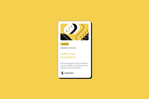
Your final result is great! I am also guilty of jumping around my CSS code a lot but I don't think we are alone there!
With resizing in general, it gets a lot easier if you do a global reset when you start your CSS. That way you can remove all default padding and margins made by browsers, but it also makes it consistent across all browsers as they have to follow your CSS rules. Plus when you begin your own styling, it means that there are less headaches as there are no hidden margins/paddings that will cause an unwanted affect. (There is more to it than padding/margins, I'm just using them as examples).
With font-sizing, I have had a look at your code and I'm a little unsure what it means). You either want to use px or ideally rem (which means that user preferences are respected and it will scale depending on the root/html element which everything is a child of).
Example:
HTML:
<p>"I used to be an adventurer like you, then I took an arrow in the knee."</p>
CSS:
p {
  font-size: 20px;
/*   font-size: 1.25rem; */
}
I have commented out the rem unit, but if you copy this to your coding editor and comment the 20px line instead, you will not see a difference.
I highly recommend this video for more details on how to work with font sizes and how rem works.
I would also recommend looking into:
- Short video explaining more about global resets.
- I've seen a few people on here use this website. Some of it I personally think is a little too much or things I personally wouldn't use at this stage but there is enough here for you to delve deeper into if you wish.
- box-sizing - personally I think setting it to border-box makes it a lot easier to figure out sizes for elements.
I hope something here is of use to you. I look forward to seeing your coding journey continue! I'm at a similar stage on here myself 😄


