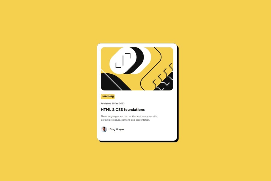
Design comparison
Solution retrospective
I used CSS Variables for colors that simplifies project maintenance and customization, which is a good practice.
What challenges did you encounter, and how did you overcome them?I learned how to use box-shadow to add subtle depth to elements, which enhances the design visually. I also used some aspects of BEM (Block Element Modifier)
What specific areas of your project would you like help with?I intend to continue improving and applying suggestions. For example, in this project I used BEM in the CSS class names and used rem in the fonts instead of pixels. In the next project I also intend to start with a CSS reset.
Community feedback
- @MikDra1Posted about 2 months ago
Well done, here are some things to review ๐:
-
Overusing div tags: Try using more semantic HTML elements like
<section>
,<header>
, and<article>
. Itโll help with both accessibility and SEO. -
Neglecting responsive design: Make sure you're using media queries and following a mobile-first approach so your site looks great on all devices.
-
Inconsistent class naming: Itโs easy to end up with a mess of class names. Consider using a system like BEM for better organization and scalability.
-
Using px for everything: Instead of
px
for fonts and layouts, try using relative units likerem
orem
to make your design more adaptable to different screen sizes. -
Forgetting alt text on images: Donโt skip the
alt
attribute. Itโs essential for accessibility and helps search engines understand what your images are. -
Poor use of Flexbox and Grid: Be careful not to mix Flexbox and Grid unnecessarily. Each has its strengthsโuse the right one based on the layout needs.
-
Not testing across browsers: Donโt forget to check how your site looks in different browsers like Firefox and Safari. Cross-browser testing is super important.
-
Ignoring accessibility: Focus on features like keyboard navigation, contrast ratios, and ARIA labels. They make your site usable for more people.
-
Using fixed heights for elements: Setting fixed heights can cause overflow issues. Use
min-height
or allow content to expand naturally to avoid problems. -
Not using responsive images: Be sure to use
srcset
or the<picture>
element to optimize images for different devices. This improves performance, especially on mobile.
Hope you found this comment helpful ๐๐๐
Good job and keep going ๐๐๐
Marked as helpful0 -
- @fraserjubbPosted about 2 months ago
Well done on this project! I've also just learned CSS variables and it does make it SO much easier!
Small suggestions I would try to implement:
-
With your BEM, try giving it a more specific name. For example, instead of
main__description
, change it tocard__description
. This makes which element it is more clear and will make the jump to bigger projects (which will have many more components) easier. -
In CSS, when using the
height
property, ask yourself "Do I really need to set height here?" If yes, use amin-height
. You want to avoid heights on container/text elements when you can and let the content do the work there (unless there is a background color on that element, in which case height might be needed depending on various factors). -
Finally, try and replace
px
withrem
as this makes your code more responsive. This video should help explain this all in better detail and give better examples as to when to use each unit.
As you mentioned you'll be implementing CSS resets next. Make sure this is the first piece of CSS you apply before anything else and it will make styling a lot easier!
Hope this helped, I look forward to seeing your progress ๐
Marked as helpful0 -
Please log in to post a comment
Log in with GitHubJoin our Discord community
Join thousands of Frontend Mentor community members taking the challenges, sharing resources, helping each other, and chatting about all things front-end!
Join our Discord