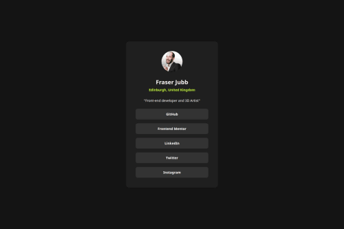
Submitted about 1 year agoA solution to the Social links profile challenge
Social Links Profile Solution - Challenge #3
bem
P
@fraserjubb

Solution retrospective
What are you most proud of, and what would you do differently next time?
- I learned how
flexandmax-widthcan work together, as well as how child elements can impact what is seen in the browser. - Figured out how to use the picture element to improve accessibility.
- I also personalised the links, text and photo.
- I have found
flexto be quite challenging. Even though I got there in the end, it was quite time consuming. - Understanding which image was being rendered by the browser when using the picture element. I now know where to look in the inspector which will be useful going forward.
Any feedback or tips for improvement is welcome 🙂
Code
Loading...
Please log in to post a comment
Log in with GitHubCommunity feedback
No feedback yet. Be the first to give feedback on Fraser Jubb's solution.
Join our Discord community
Join thousands of Frontend Mentor community members taking the challenges, sharing resources, helping each other, and chatting about all things front-end!
Join our Discord