Design comparison
Solution retrospective
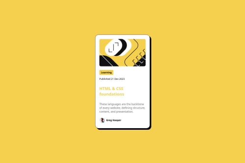
I would like to know if there is a better way of coding the output. Are there best practices that I could have applied or are there unnecessary elements, classes, or CSS that I added that will have the same result if those are removed? I will greatly appreciate your opinions and suggestions. Thanks
Community feedback
- @fraserjubbPosted about 2 months ago
Nice work! I'm also working on the "Newbie" challenges atm, so take what I say with a grain of salt as I am still learning too.
Small suggestions I would try to implement:
- I think had you opted for flexbox instead of CSS-grid, it would require less HTML containers, which would also lead to more concise code. You really only want to use containers for grouping. I've not watched this particular video yet, but this has been a good channel for me in the past, it looks like in this video, there will be more detail on when is best to use each one.
As for your CSS:
- You have a typo on line 80:
height: fi;
. At least I think it is a typo 😅 - With your font sizes, try and replace
px
withrem
as this makes your code more responsive. This video should help explain this all in better detail and give better examples as to when to use each unit. - Finally, more just for this website, make sure to update your screenshot so that it is the default browser state - it just helps for seeing an easy comparison between your solution and the initial design 🙂
Marked as helpful1@HiraeightPosted about 2 months agoHi Fraser! thank you for your suggestions, I will gladly apply your suggestions and update my code for this activity 🙂
1 - @SvitlanaSuslenkovaPosted about 2 months ago
I think it's a good project, you can go for harder projects.
0
Please log in to post a comment
Log in with GitHubJoin our Discord community
Join thousands of Frontend Mentor community members taking the challenges, sharing resources, helping each other, and chatting about all things front-end!
Join our Discord