Skip to content
Learning paths
Challenges
Solutions
Articles
Unlock Pro
Log in with GitHub
Profile
Overview
Solutions
5
Comments
0
Ibrahim Suleiman
@ebeeraheem
Follow
All solutions
Submitted about 1 year ago
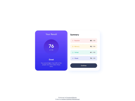
Results summary component solution
HTML
CSS
0
5
0
Submitted about 1 year ago
Stats Preview Card | Frontend Mentor
HTML
CSS
1
4
0
Submitted about 1 year ago
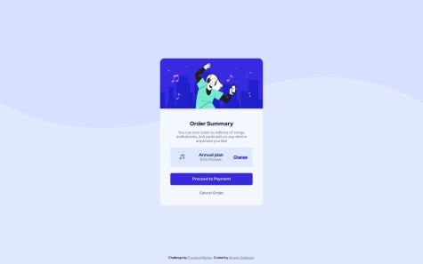
Order summary | Frontend mentor
HTML
CSS
1
2
0
Submitted about 1 year ago
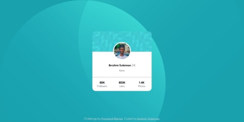
Profile Card | Frontend Mentor
HTML
CSS
2
2
0
Submitted about 1 year ago
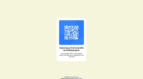
QR code component
HTML
CSS
1
6
0