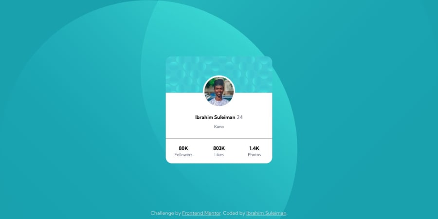
Design comparison
Solution retrospective
HELP NEEDED
- I'm having serious trouble setting the background position of the images in this challenge
- Is there an easier or more efficient way to position the numbers in the stats, i.e the followers, likes, and photos?
Community feedback
- @mikaeljanPosted about 1 year ago
Regarding the stats for the card
- stats-child do not need
display flex - on stats set
justify-contenttospace-between/space-evenly/space-around.
Regarding the background images you have multiple images but you position only one.
try merging your
background-imagewithbackground-position: top left, bottom right;into
background: url(first_image.jpg) right bottom no-repeat, url(first_image.jpg) left top repeat;And use % or pixels for more precise positioning.
Marked as helpful1@ebeeraheemPosted about 1 year ago@mikaeljan Woah thanks man!
I knew about the
space-property but didn't know where or when to use it. I'll be sure to check it out.You're awesome 💯👍
0@mikaeljanPosted about 1 year ago@ebeeraheem I made a mistake in my comment.
space-between/space-evenly/space-aroundare values forjustify-contentproperty notdisplay. so you need to setjustify-contentwith one of those values.0 - stats-child do not need
- @NaQu2003Posted about 1 year ago
Have you tried using pixels? I can see that you set up this top,right and bottom,left: but you can move those images with pixels or percantage
0@ebeeraheemPosted about 1 year ago@NaQu2003 Thank you. I honestly wasn't aware I could do that. I'll definitely check it out!
0
Please log in to post a comment
Log in with GitHubJoin our Discord community
Join thousands of Frontend Mentor community members taking the challenges, sharing resources, helping each other, and chatting about all things front-end!
Join our Discord
