

Design comparison

Solution retrospective
HELP NEEDED
This has been the toughest challenge I've taken yet.
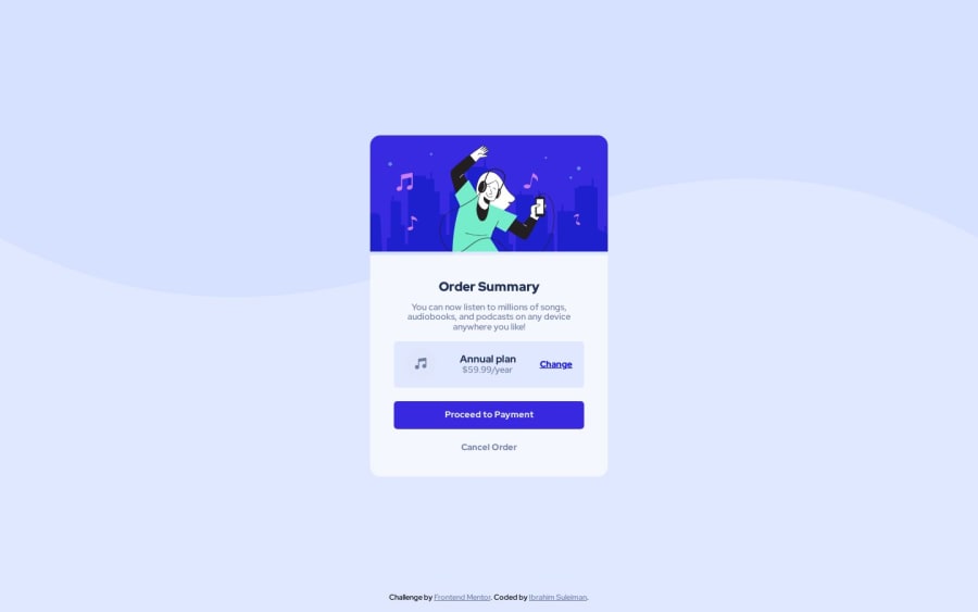
- The first issue I'm having is the little space between the hero image and the bottom of the card
.topand.bottomclasses. I have no idea why it's the when it shouldn't be. - The second issue was with the
.plansection of my card where the music icon, plan details and change link are located. I cant seem to be able to arrange them as in the design guide.
How can I remove the space in the first issue? Also, how can I better arrange the items in the plan details .plan of the card?. My best guess is using the css grid but I have no idea how.
Community feedback
- @Slimani-CEPosted about 1 year ago
Hey Ibrahim,
Addressing the first challenge, try setting the height of the image element within the
.topclass to 100% and customize the height of the.topelement itself to be 170px. This should eliminate the unwanted space between the hero image and the bottom of the card.Now, for the second issue related to the arrangement of items in the
.plansection, consider the following steps:- Remove
justify-contentfrom the.planclass. - Add a padding of 15px to the
.planclass. - Introduce
position: relativeto the.planclass. - Apply
position: absolute; right: 15px;to the third child of the.planclass. If needed, you can assign a custom class to this child or select it using.plan:nth-child(3).
0@ebeeraheemPosted about 1 year ago@Slimani-CE
Hi Mustapha, thank you for taking the time to respond to my plea. I really appreciate it.
The first issue was resolved by following your recommendation. The second however, was a bit trickier. I had to use padding on the left and right of the
detailclass to get it to work.Thank you so much for your help.
1 - Remove

Please log in to post a comment
Log in with GitHubJoin our Discord community
Join thousands of Frontend Mentor community members taking the challenges, sharing resources, helping each other, and chatting about all things front-end!
Join our Discord