Davide
@deedeedevAll comments
- @hgcfkuyfliyflSubmitted about 1 year ago@deedeedevPosted about 1 year ago
Hi @hgcfkuyfliyfl , nice job! If you want to position the card at the center without setting a fixed height you can put it inside a div container and center it with flex, like this:
.container: {
  width: 100%;
  min-height: 100dvh;
  display: flex;
  justify-content: center;
  align-items: center;
}

.card {
  min-width: 350px;
}
Using
min-width,max-width,min-heightandmax-heightinstead of fixed values makes your design more flexible and responsive. In most cases I try to avoid using percent values when setting width/height, you easily get weird outcomes on very large or very small screens. A better approach in my opinion is using media queries and adapt yourmax-widthandmin-widthaccording to the screen size. You might also want to look into container queries: using them you can write media-queries that are based on the container size instead of the screen size.Hope this can be helpful!
0 - @rahul11636Submitted about 1 year ago@deedeedevPosted about 1 year ago
Hi @rahul11636 , nice job. To improve the responsiveness of the card you might want to avoid setting a percent width on your container div and use a fixed width or a maximum width in px or rem. So instead of doing:
.mini-container {
  width: 25vw;
}
you could try something like:
.mini-container {
  max-width: 24rem;
  padding: 20px;
}
To fix the problem with the image you can remove the
position: relativetopandleftrules and just applywidth: 100%.The approach is this: use a container with a fixed width/max-width (that can change using media queries, depending on display size) then apply some padding on it and place your content inside. You might also want to look into
flexbox, it really simplifies content aligning once you grasp how it works.Keep up the good work! 👍
Marked as helpful0 - @bv-andreaseSubmitted about 1 year ago@deedeedevPosted about 1 year ago
Hi @bv-andrease , your project looks very nice, the only thing I would change is increasing the font size a little bit and adjust margins and padding accordingly. 10px is quite small and not very accessible. Default font size on almost all browsers is 16px.
Other than that, awesome job! 👍
1 - @ad-monir2001Submitted about 1 year agoWhat are you most proud of, and what would you do differently next time?
It was my first project on this site. And I have not used any max-width on this so it is not looking good , I have improved that now.
What challenges did you encounter, and how did you overcome them?On responsiveness.
What specific areas of your project would you like help with?You any kind of suggestion will be welcomed,
@deedeedevPosted about 1 year agoHi @ad-monir2001 , you might want to wrap all your top-level divs in a "container" div and apply a
max-width: 1024pxandmargin: autoon that, so the content doesn't get too wide on larger monitors. You can apply amax-widthto the nutrition div too and for the class.textsswitch fromjustify-content: space-aroundtojustify-content: space-betweenso that the values align nicely on both sides of the div.Other than that, nice job! 👍
1 - @sefoo333Submitted about 1 year ago@deedeedevPosted about 1 year ago
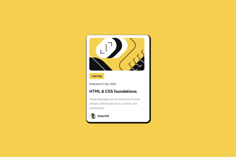
Hi @sefoo333 , you might want to add a little padding to the
.parclass, around the card content, something like 20px, and also change width and height of the svg image towidth: 100%andheight: 100%, so that it stretches all along the card width.Other than that, nice job!
Marked as helpful1


