Design comparison
Solution retrospective
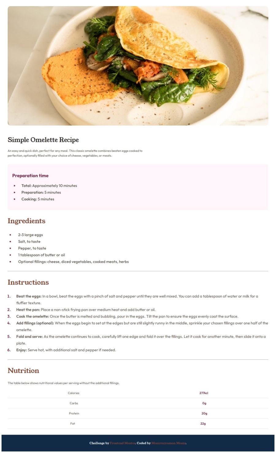
It was my first project on this site. And I have not used any max-width on this so it is not looking good , I have improved that now.
What challenges did you encounter, and how did you overcome them?On responsiveness.
What specific areas of your project would you like help with?You any kind of suggestion will be welcomed,
Community feedback
- @deedeedevPosted about 1 year ago
Hi @ad-monir2001 , you might want to wrap all your top-level divs in a "container" div and apply a
max-width: 1024pxandmargin: autoon that, so the content doesn't get too wide on larger monitors. You can apply amax-widthto the nutrition div too and for the class.textsswitch fromjustify-content: space-aroundtojustify-content: space-betweenso that the values align nicely on both sides of the div.Other than that, nice job! 👍
1@ad-monir2001Posted about 1 year ago@deedeedev Thanks a lot..
For your amazing advice.. I have corrected that.
1
Please log in to post a comment
Log in with GitHubJoin our Discord community
Join thousands of Frontend Mentor community members taking the challenges, sharing resources, helping each other, and chatting about all things front-end!
Join our Discord
