Design comparison
Solution retrospective
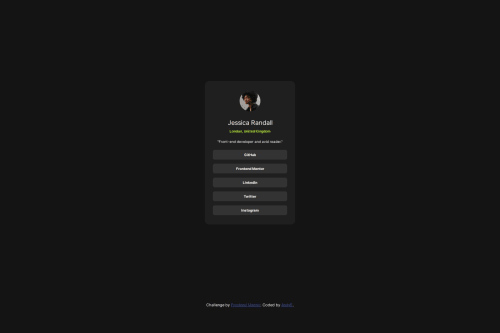
First attempt to design this social links profile from Frontend Mentor. How is the mobile version? Are there any points missing?
Community feedback
- @Fejiro001Posted 11 months ago
Hi @bv-andrease work solution looks good. I believe if you want more responsive text you should use clamp(). You can read up on it. clamp() allows your text size vary from a minimum to maximum range so your text can be readable no matter the device its on.
2 - @deedeedevPosted 11 months ago
Hi @bv-andrease , your project looks very nice, the only thing I would change is increasing the font size a little bit and adjust margins and padding accordingly. 10px is quite small and not very accessible. Default font size on almost all browsers is 16px.
Other than that, awesome job! 👍
1@bv-andreasePosted 11 months ago@deedeedev Thank you for your helpful feedback! I stuck too strictly to the design template screenshots. I've increased the font-size a little bit. If I use 16px the links become too big in my opinion. I have to think about that.
0
Please log in to post a comment
Log in with GitHubJoin our Discord community
Join thousands of Frontend Mentor community members taking the challenges, sharing resources, helping each other, and chatting about all things front-end!
Join our Discord