David Oncu
@david-oncuAll comments
- @iremozturkk3Submitted over 2 years ago@david-oncuPosted over 2 years ago
Congratulations on your solution:
Few suggestions to fix accessibility issues:
<div class="main-container"> <img src="images/image-qr-code.png" alt="qr-code-pic"> <h2>Improve your front-end skills by building projects</h2> <p> Scan the QR code to visit Frontend Mentor and take your coding skills to the next level</p> </div>: change div to main :
<main class="main-container"> <img src="images/image-qr-code.png" alt="qr-code-pic"> <h2>Improve your front-end skills by building projects</h2> <p> Scan the QR code to visit Frontend Mentor and take your coding skills to the next level</p> </main> <div class="attribution"> Challenge by <a href="https://www.frontendmentor.io?ref=challenge" target="_blank">Frontend Mentor</a>. Coded by <a href="#">Your Name Here</a>. </div>change div to footer
<footer class="attribution"> Challenge by <a href="https://www.frontendmentor.io?ref=challenge" target="_blank">Frontend Mentor</a>. Coded by <a href="#">Your Name Here</a>. </footer>Overall great solution!
Marked as helpful0 - @magda-korzeniowskaSubmitted over 2 years ago
Hello, Frontend Mentor community! This is my first submission here. Open to suggestions!
@david-oncuPosted over 2 years agoCongratulations Magda on your solutions!
Few suggestions on accessibility issues:
All page content should be contained by landmarks
Context:
<div class="attribution"> Challenge by <a href="https://www.frontendmentor.io?ref=challenge" target="_blank">Frontend Mentor</a>. Coded by <a href="https://github.com/magda-korzeniowska">Magda Korzeniowska</a>. </div>- change the "div" to the "footer":
All page content should be contained by landmarks
Context:
<article class="card">- change the "article" to "main".
Overall great solutions.
Marked as helpful0 - @asdfjenniferSubmitted over 2 years ago
Hello, I hope you like it! Any advice will be appreciated :)
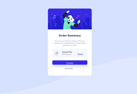
I'm not satisfied with the Payment button. Anyone know how to fix this? The text won't be inline and it still won't work after adding max-height to the button.
Also 'Change' is not inbetween 'Annual plan' and '$59.99/year'
@david-oncuPosted over 2 years agoCongratulations on your solutions! There are many ways to fix the button and the 'Change' button here are my suggestions:
For the "Proceed to Payment" button add:
body section .container footer .firstButton { width: 100%; display: grid; padding: 1rem 2rem; }
For the "Change" add:
body section .container main .annualPlan a { margin-top: 0.5rem; }
0 - @nidaismailSubmitted over 2 years ago
Happy to complete another challenge, looking forward to feedback.
@david-oncuPosted over 2 years agoHello Nida, congratulations on another solution!
Accessibility:
-
Set a role for your "main-container" between div and .main-container add role="main" - more about this here: https://developer.mozilla.org/en-US/docs/Web/Accessibility/ARIA/Roles
-
When using h1, h2, h3, h4 scale them from highest h1 to h2, h3, h4, h5, etc. in chronological order. Change your h3 to h2.
-
For your <div class="attribution"> give a landmark. Add between div and class="... role="footer" > <div role="footer" class="attribution">
Overall great solution and clean code! Good job!
Marked as helpful0 -
- @david-oncuSubmitted almost 3 years ago
Hey Everyone,
I'm open to any suggestions and improvements.
Thanks!


