Clifford Anderson
@cdanderson76All solutions
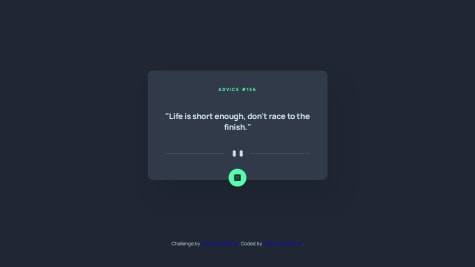
Advice Generator App (HTML, CSS, and JavaScript)
#accessibilitySubmitted 11 months agoNot really, but if anyone would like to add anything to the short story that I have above, feel free. Trying to become as knowledgeable as I can in reference to putting these projects together. Thanks...
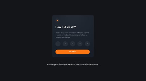
Interactive Rating Component Using Vanilla JavaScript and Flexbox
Submitted 11 months agoI think I got most of my answers that I had researched, but by all means, any productive input on how I can improve this is more than acceptable.
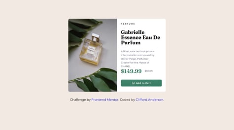
Product Preview Card Utilizing HTML and CSS
#accessibilitySubmitted 12 months agoI don't think there is anything that I needed help with, but tips and comments are always helpful. I just want to get better every day...
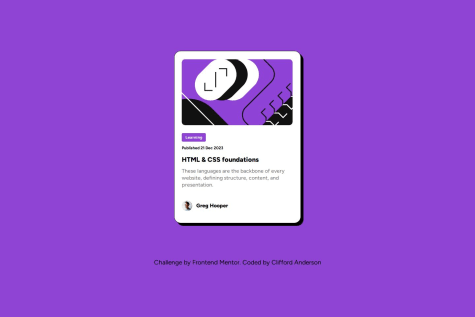
Blog Preview Card Using Flexbox
Submitted about 1 year agoI don't think that there is anything that I needed help with, but tips and comments are always useful. I don't think I had too many issues putting this project together, however.
Social Links Profile Using HTML and CSS
Submitted about 1 year agoI don't think that there is anything that I needed help with, but tips and comments are always useful. I don't think I had too many issues putting this project together, but feedback is always good...