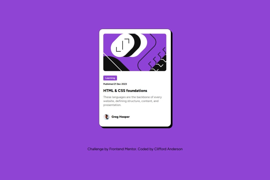
Design comparison
Solution retrospective
There wasn't a lot of changes that I could make to this project...maybe just the color scheme. However, I was able to go into figma and change the color of the design to make it stand out from other designs. Not a HUGE deal, but I am proud that I made that change.
As far as what I would do differently next time, I would be sure to add all of my HTML first, and then style it all out at the end. I believe I had more trouble than I should have with the footer this go-around, but I was able to make it happen.
What challenges did you encounter, and how did you overcome them?When converting from pixes to 'ems', I experienced some unexpected outcomes in which the font was to little or too small, or even when some of the widths became too small. This happened within my '.published' and '.foundations' classes. Here I just stuck with pixels, but made sure I tested the responsiveness to make sure everything was ok.
Another problem that I encountered was getting the footer in the appropriate place. For some reason, whenever I checked the design on my mobile phone, the footer was smashed up against the blog preview card. No matter what changes I made, the footer wouldn't adjust. I finally went back and reviewed a previous project that I did, and found that I didn't use 'align-items: center' for my '#canvas' (contains the card). Once I added that, I was able to adjust the footer to my liking.
What specific areas of your project would you like help with?I don't think that there is anything that I needed help with, but tips and comments are always useful. I don't think I had too many issues putting this project together, however.
Community feedback
Please log in to post a comment
Log in with GitHubJoin our Discord community
Join thousands of Frontend Mentor community members taking the challenges, sharing resources, helping each other, and chatting about all things front-end!
Join our Discord
