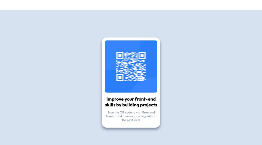
Desktop Solution for the QR Code Project using Flexbox
Design comparison
Solution retrospective
I think that the key for me to complete this project was using Figma to get the actual dimensions for the card. With this, I think I was able to code the project more accurately. The first time I tried this, I didn't have the dimensions, and wasn't using Figma (didn't even see that it was a 'thing' at first), so I found it to be a really big help once I started using it.
Second, I feel like I struggled a little with positioning containers using Flexbox. I'm still trying to get comfortable with CSS Grid, and as I continue to work on those skills, I feel like I will slowly start to implement it. But until then, I'm fairly comfortable using Flexbox to complete projects. Outside of that, just as I stated before, once I had the dimensions for this project, the tougher part was just positioning the containers and making sure that everything was aligned properly. I try to follow everything that I'm learning in reference to clean code ('do not repeat yourself' often stays in my head), and I want my code to be efficient. So if anyone has any tips on that, I would really appreciate it. Thanks...
Community feedback
Please log in to post a comment
Log in with GitHubJoin our Discord community
Join thousands of Frontend Mentor community members taking the challenges, sharing resources, helping each other, and chatting about all things front-end!
Join our Discord
