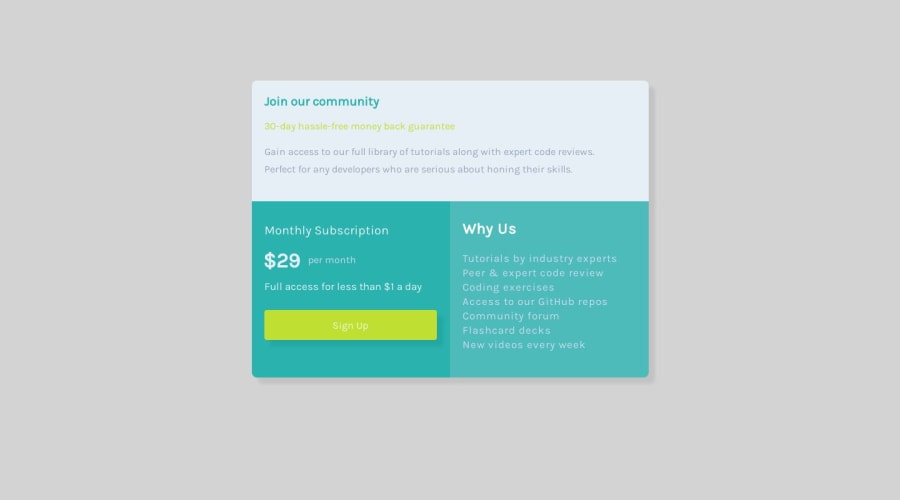
Single Price Grid Component Using Flexbox
Design comparison
Solution retrospective
This project turned out to be a little more difficult as I got deeper into the process of completing it. I'm not sure if I had the correct specifications for the mobile layout, as 'Figma.com' had measured the width to be 362px, but it looks as if the actual width was a little more than what was listed. I also had a problem centering this design, as I utilized percentages in order to keep it centered. However, as I shrank/grew my screen, I wasn't really satisfied with how the design creeped up and down the page. I elected to use volume height and width instead, and now the design looks stabilized while shrinking and enlarging the screen. In addition, I did my best to make the most efficient adjustments, but I feel that my code got a little messy on this one. I'm continuously looking through ways I could make it cleaner, but I'm unable to come up with anything. I'm happy with this project, but if there is anything that I could have done better, definitely let me know.
Community feedback
Please log in to post a comment
Log in with GitHubJoin our Discord community
Join thousands of Frontend Mentor community members taking the challenges, sharing resources, helping each other, and chatting about all things front-end!
Join our Discord
