

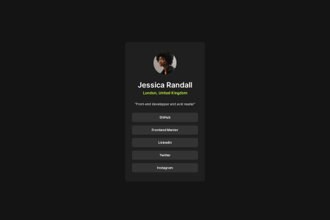


@a-fox-on-the-moonSubmitted about 1 year ago
Latest solutions
Latest comments
- @a-fox-on-the-moonPosted about 1 year ago
Hi @danielmrz-dev !
I did a box-shadow at first but then the result wasn't good, the right section doesn't go "under" the left section, you can see the top left and bottom left corners and it isn't like this on the original design.
I wanted to put a screenshot here to show you but it doesn't work so I updated the code on GitHub if you can look at it
Thanks for your feedback !
1 - @a-fox-on-the-moonSubmitted about 1 year ago@a-fox-on-the-moonPosted about 1 year ago
Hi ! Thanks a lot for your feedback ! I will make the changes.
I have trouble knowing when and how to use the %, rem, px etc for the width and height. Can you help me with that, please ?
When I put the min-height : 100vh on the body, a vertical scroll bar appears, any idea why ?
For the media queries, isn't simpler to do the wide screen styles first and the mobile styles after ? For the few projects I've done, I always did the wide screen first :/ I have the feeling that it simpler to do so because I usually remove some elements on the mobile styles...
0

