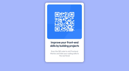
Not Found
Not Found
Not Found
Not Found
Not Found
Not Found
Not Found
Not Found
Not Found
Not Found
Not Found
Not Found
Not Found
Not Found
Not Found
Not Found
Not Found
Not Found
Not Found
Not Found

Submitted

QR code component using HTML and CSS

@a-fox-on-the-moon

Desktop design screenshot for the QR code component coding challenge

This is a solution for...

  • HTML
  • CSS
1newbie
View challenge

Design comparison


SolutionDesign

Solution retrospective


(please excuse my many mistakes in english, it's not my native language)

I'm a newbie in the field so I tried my best ! Let me know if you have some suggestions to make this code simpler and clearer :)

Community feedback

P

@Islandstone89

Posted

Hi, congratulations on finishing this challenge! Here is some feedback which I hope will help you :)

HTML:

  • Every webpage needs a <main> that wraps all of the content, except for <header> and footer>. This is vital for accessibility, as it helps screen readers identify the "main" section of a page. Change .main into a <main>.

  • You can remove the divs, as they are not needed.

  • The alt text should be written naturally, and in this example, the alt text must also say where it leads. So instead of qr-code-image you should write qr code leading to the Frontend Mentor website. Screen readers recognize it as an image automatically, so you should not use words like "image" or "photo".

CSS:

  • It's good practice to include a CSS Reset at the top.

  • Use the style guide to get the correct background-color for the body.

  • font-size must never be in px. This is bad for accessibility, as it prevents the font size from scaling with the user's default setting in the browser. Use rem instead.

  • On body, remove max-width, max-height and margin. Add min-height: 100vh - this way, the card gets also centered vertically.

  • Remove all widths in %. Add a max-width of around 20rem on the card, to prevent it from getting too wide on larger screens.

  • Remove the margin on the card. Add some padding on all 4 sides.

  • The space between the image and the card edges is done using the mentioned padding. Hence, it doesn't need any margin.

  • Add display: block and max-width: 100% on the image - the max-width prevents it from overflowing its container.

  • As the design doesn't change, there is no need for any media queries. When you do need them, they should be in rem, not px. Also, it is common practice to do mobile styles first and use media queries for larger screens.

Good luck :)

Marked as helpful

0

@a-fox-on-the-moon

Posted

Hi ! Thanks a lot for your feedback ! I will make the changes.

I have trouble knowing when and how to use the %, rem, px etc for the width and height. Can you help me with that, please ?

When I put the min-height : 100vh on the body, a vertical scroll bar appears, any idea why ?

For the media queries, isn't simpler to do the wide screen styles first and the mobile styles after ? For the few projects I've done, I always did the wide screen first :/ I have the feeling that it simpler to do so because I usually remove some elements on the mobile styles...

0

Please log in to post a comment

Log in with GitHub
Discord logo

Join our Discord community

Join thousands of Frontend Mentor community members taking the challenges, sharing resources, helping each other, and chatting about all things front-end!

Join our Discord