Submitted almost 2 years agoA solution to the Social links profile challenge
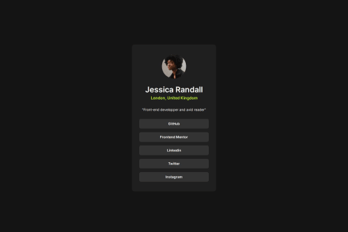
Social links with HTML and CSS
@a-fox-on-the-moon

Solution retrospective
Hi everyone !
Pretty simple challenge, I still wanted to do it because I want to re-use it for myself in the future.
I would love some feedback anyway :)
Code
Loading...
Please log in to post a comment
Log in with GitHubCommunity feedback
No feedback yet. Be the first to give feedback on a-fox-on-the-moon's solution.
Join our Discord community
Join thousands of Frontend Mentor community members taking the challenges, sharing resources, helping each other, and chatting about all things front-end!
Join our Discord