Results summary component using HTML and CSS
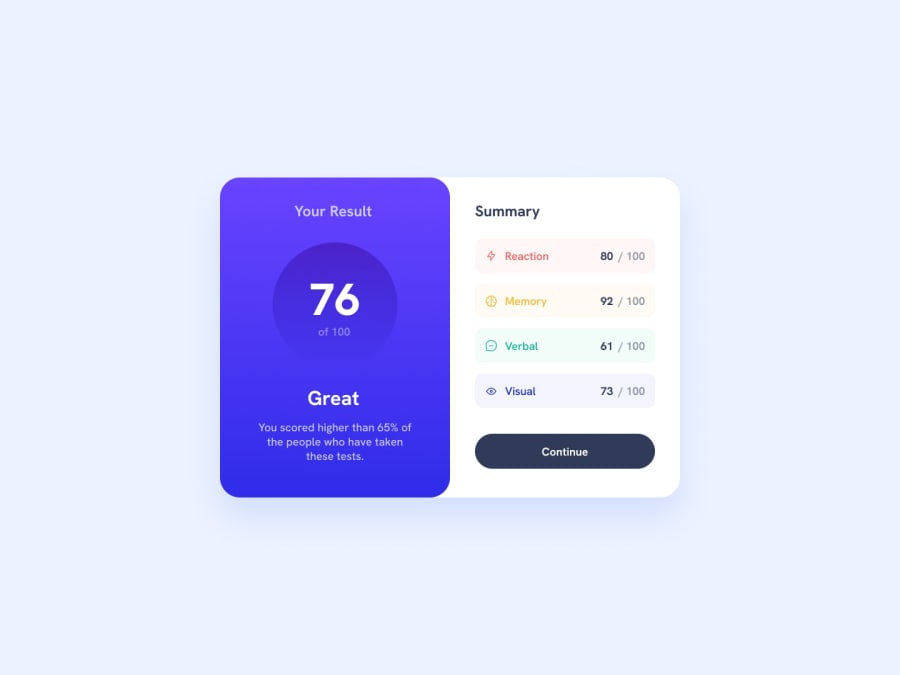
Design comparison
Solution retrospective
Hi !
I tried my best with this challenge.
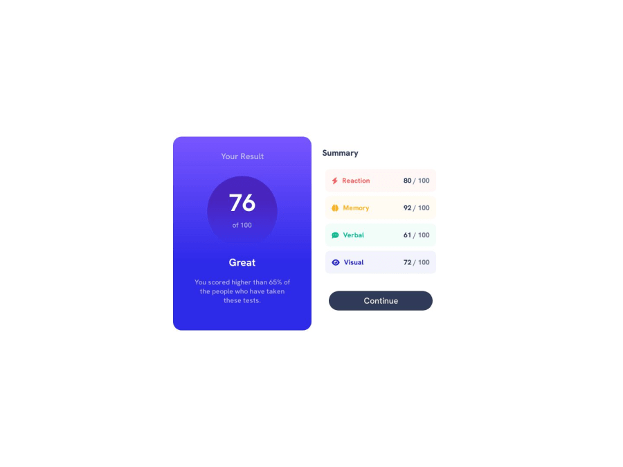
I struggled a LOT with the gradient and the circle. I don't think I coded this the right way. I used icons from "Font Awsome" for the Summary part because I didn't saw that they were in the starter pack x(
I did the desktop style first because it's easier for me and I added a few media queries to make it approximately responsive.
I have some problems when the page is translated in another language (french), the first score is written "80 / 100_" and all in bold, don't know why. Is there something I can add in the head of the HTML to correct this ?
I'd love some feedbacks on this code because I think it is really far from being good.
Thanks a lot in advance :)
Community feedback
Please log in to post a comment
Log in with GitHubJoin our Discord community
Join thousands of Frontend Mentor community members taking the challenges, sharing resources, helping each other, and chatting about all things front-end!
Join our Discord
