Latest solutions
Rest Countries API with color theme switcher
#bem#react#styled-components#typescript#fetchSubmitted about 2 years ago
Latest comments
- @Dng120696Submitted about 2 years ago@Yehan20Posted about 2 years ago
Hello Congratulations on Completing the challenge your solution looks amazing. regarding feedback you can try to match the design a bit more. and its considered good practice import the google font from your html file , instead of the css file. you can change the box-sizing to
border-boxin your ```*`` selector which tells you to. tells the browser to account for any border and padding in the values you specify for an element's width and height. other than that every thing was perfect, i hope this helped , good luck in the next challenges0 - @ledigraceSubmitted about 2 years ago@Yehan20Posted about 2 years ago
Hello there , congratulations on completing the solution it looks awesome , it would be good practice to name the alt tag in the image , with a meaningful name, also i noticed that you have installed the Google font in your CSS and HTML both , that's not needed you can remove one of them , I'd recommend removing the CSS import. Next its considered good practice to add a universal selector in the top of your style sheet and set the box-sizing to border box which tells your the browser to account for any border and padding in the values you specify for an element's width and height. You can try to increase the width of the card as it kind of looks less long than in the design , i hope this helped good luck in other challenges .
Marked as helpful0 - @karimAoulallaySubmitted about 2 years ago
responsive design built with react, react-router, vitejs and tailwind
#react#react-router#tailwind-css#vite@Yehan20Posted about 2 years agoHey congrats for making the solution , I Belive the issue is that since we refresh the use params hook gives you undefined so it will give 400 status error. Therefore you can basically get the exertions from the URL when you refresh the page and then call the API request, i assume you are using the useParams hook to get the country code when clicked , so you can do this
    let { id } = useParams(); //
    if (id === undefined) {
        id = (window.location.pathname).split('/')[2]
    }
//https://restcountries.com/v3.1/alpha/id/ - this will be the new url then it would fetch the data
so now you have the country code, and then you can send it with your AJAX request to get the data , I hope this helped.
Marked as helpful0 - @Fede2797Submitted about 2 years ago@Yehan20Posted about 2 years ago
Hey Congratulations on completing the challenge , the solution looks cool , however i the nav bar doesn't work for me in mobile view , also the drop-down item styles have not been applied , also i see some side scrolling in the mobile view , also there is some additional padding in some parts , I hope this was helpful good luck in other challenges
Marked as helpful0 - @KathrynDavies123Submitted over 2 years ago@Yehan20Posted over 2 years ago
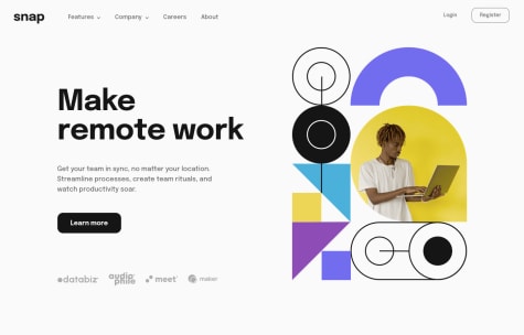
Hello there you solution looks awesome and clean , congratulations. For the register and learn more buttons , I think having an <a> tag would be fine because in a real use case it will be some sort of link. instead of the button. and if you have decided to make the header fixed , try to make the nav bar fixed as well so it will better. Also check out on the html report. include and alt tag on the image elements. Good Luck in other challenges as well.
Marked as helpful0 - @monstermaashSubmitted over 2 years ago@Yehan20Posted over 2 years ago
Hey Congratulations on Completing the challenge. The Solution Looks neat. you can focus on the accessibility issues on the issues to make your improve your solution. For the mobile menu you just need to create a button and set the display: none in large screen and then make it visible in small screens using display: block. and you need to make the mobile menu get full height of the view port . I used fixed position for this and. I assume if you are using flex box. you could make the nav links to column using flex direction Coolum. and in order to make the nav bar full height just set the top , left , bottom values to 0 and. set the width to x% depend on the layout. after that create a class that would make Tthe nav bar hide , you can use transform:translateY(100%) to archive this then. from your JS you need to make an event that would toggle the classes of the nav bar when you click so your functionality. works. I hope this helped .
Marked as helpful0


