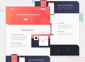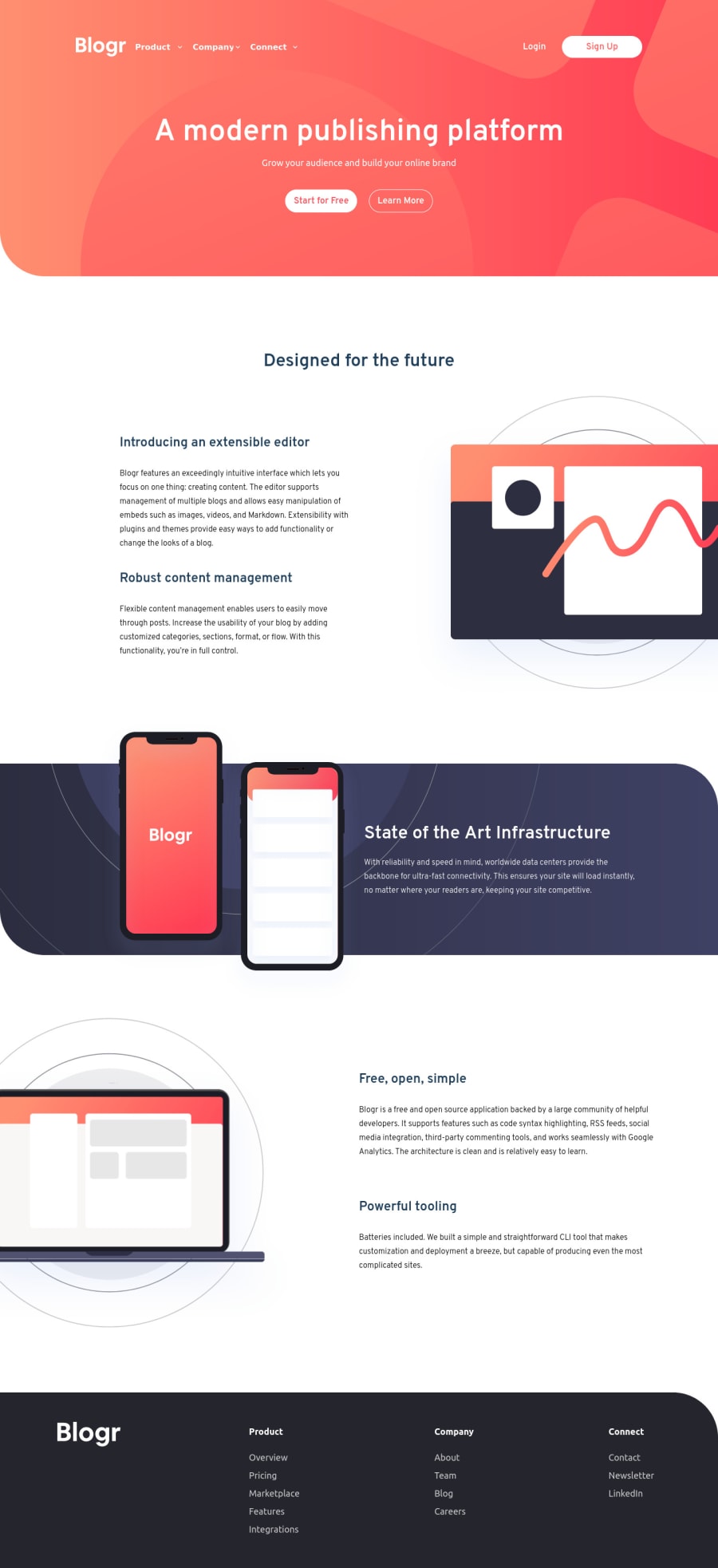
Design comparison
Solution retrospective
Hi there!, Iām Federico and this is my solution for this challenge.
Built with TailwindCSS and plain HTML
Any suggestions or comments are really appreciated.
Thank you š
Community feedback
- @Yehan20Posted over 1 year ago
Hey Congratulations on completing the challenge , the solution looks cool , however i the nav bar doesn't work for me in mobile view , also the drop-down item styles have not been applied , also i see some side scrolling in the mobile view , also there is some additional padding in some parts , I hope this was helpful good luck in other challenges
Marked as helpful0@Fede2797Posted over 1 year ago@Yehan20 Thanks for the feedback! The only thing I'm curious about is that side scrolling, works perfectly fine on my device and on responsive-mode in the browser. All the other things I'm aware of, but they are out of the scope of my personal goal for this challenge.
Thank you again for the feedback though :D
0
Please log in to post a comment
Log in with GitHubJoin our Discord community
Join thousands of Frontend Mentor community members taking the challenges, sharing resources, helping each other, and chatting about all things front-end!
Join our Discord