


@iFlameingSubmitted 6 months ago
Latest solutions
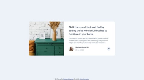
Article preview component solution
#bem#oocss#smacss#accessibilitySubmitted 5 months ago- I would like some tips on naming the classes and styling using BEM, SMACSS and OCSS. I used them, but I know there's a lot of room for improvement. Also I would like the same tips for namespaces, although I didn't use them here;
- JavaScript tips;
- Tips in general.
Testimonial Grid Section Solution
Submitted 6 months agoI think there's more spacing on the lower testimonials than necessary, but I couldn't find a way to fix it.
Latest comments
- @VitorEmanoelNogueiraPosted 5 months ago
Hello, Alok Kumar! This project is great! I don't know if the website bugged or you just submitted on the wrong challenge, but the design is for the article preview component (or atleast it's what's appearing for me) and not for the News Homepage challenge.
0 - @petrakowwwSubmitted 6 months agoWhat are you most proud of, and what would you do differently next time?
I want to improve my skills in the grid, write shorter styles for them using templates
- @yannanclsSubmitted 7 months ago@VitorEmanoelNogueiraPosted 7 months ago
Hello, Yanna, great job!
After seeing your codes, I have some tips that may help you:
- If you want your project to be more like the design, I recommend you to pay attention to the "Powered by Technology" and cards titles, since the have different font weigths, and to the border-radius of the cards aswell, since your project has a value higher than the original design (that I personally like better XD);
- For improvement in general, I recommend you to studying the 'em' and 'rem' unit of CSS, since using px can limit acessibility for custom configurations of font-size, etc. Here's why font-size should not be in pixels: https://fedmentor.dev/posts/font-size-px/. By learning these units and understanding when to use which one, you can use them on the font-size, margin, paddings, etc.
- Other thing I recommend is learning CSS GRID, that will alow you to place the cards like in the desktop version with much less effort.
Keep on the great work! You did great!
Marked as helpful0 - @VirshreeSubmitted 8 months agoWhat are you most proud of, and what would you do differently next time?
Finishing this project..
What challenges did you encounter, and how did you overcome them?Challenges faced was for mobile view layout and i searched for tutorial for responsiveness layout ..
@VitorEmanoelNogueiraPosted 7 months agoHi Virshree Desai! Great job!
After reviewing your code, I have a few tips that might help:
- Change the font for the paragraph and title. You accidentally confused them with each other, so the paragraph font should be in h1 and vice versa;
- Use the Fraunces font for the green price tag;
- Increase some padding and margins between the elements.
I think using a div for the card itself was unnecessary, since the main content of the template is the card, and I think that might be why your mobile design had an overflow causing the scroll bar to appear. What I used in this layout was to use the main tag for the card and just separate the other elements (image, text) using divs and sections.
I hope my tips help you and keep up the great work!
0 - @davisoutoneriSubmitted 8 months ago@VitorEmanoelNogueiraPosted 8 months ago
Hello, Davi Souto! Great job!
I couldn't access your code or preview site, so it will make a little more difficult to help, but I have some tips. From what I see in the screenshot, what you should focus mostly for your solution to look more like the design is:
- Increase the body padding to make the main container go more in the middle;
- Fix some paddings on the main container, the table rows and the list items. You should increase then a little;
- Increase the main container border radius;
- Fix the font color in the "preparation time" section.
Sorry if it's a little confusing, english is not my primary language. Hope it helps! Keep on the good work!
0 - P@catreedleSubmitted 8 months agoWhat are you most proud of, and what would you do differently next time?
I am more comfortable with my workflow this time, compared to the previous two challenges. I would like to implement the best CSS practices for the next project. I am confident with my HTML structure, but maybe I have some blind spots. I am open to feedback.
What challenges did you encounter, and how did you overcome them?I struggled a bit in showing the anchor tags as buttons, I am not sure that I've done the best approach. The list element positions were slightly off to the right, a quick search helped me override that behavior.
What specific areas of your project would you like help with?The mobile design doesn't look exactly like my final project. I have too wide horizontal gaps compared to what's shown in the design. Some help with this will be very much appreciated.
@VitorEmanoelNogueiraPosted 8 months agoHello, Purnama S Rahayu, great job, the design is great!
I have some tips that I hope help you:
- For displaying the anchor tags as buttons, what would get them to look more similar to those of the original design is adjusting the height of them so they look bigger. On my project I used 45px of height with 13px of padding-top to adjust the content of the button;
- Adjust the margin between the name and the location. I think just 10px between these two would get the design closer to the original;
- If you want to get it even closer to the original, you can try to resize the image to look a little smaller;
- To get the mobile design closer too, you can try reducing the padding a little (30px to 25px) or/and increasing the cointeiner width a little.
Overall, it's a great design! Keep improving!
Marked as helpful0


