Design comparison
SolutionDesign
Community feedback
- @VitorEmanoelNogueiraPosted 8 months ago
Hello, Davi Souto! Great job!
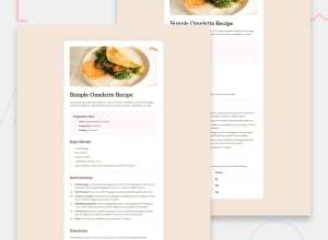
I couldn't access your code or preview site, so it will make a little more difficult to help, but I have some tips. From what I see in the screenshot, what you should focus mostly for your solution to look more like the design is:
- Increase the body padding to make the main container go more in the middle;
- Fix some paddings on the main container, the table rows and the list items. You should increase then a little;
- Increase the main container border radius;
- Fix the font color in the "preparation time" section.
Sorry if it's a little confusing, english is not my primary language. Hope it helps! Keep on the good work!
0
Please log in to post a comment
Log in with GitHubJoin our Discord community
Join thousands of Frontend Mentor community members taking the challenges, sharing resources, helping each other, and chatting about all things front-end!
Join our Discord
