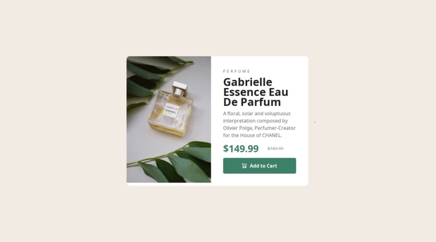
Design comparison
Solution retrospective
Finishing this project..
What challenges did you encounter, and how did you overcome them?Challenges faced was for mobile view layout and i searched for tutorial for responsiveness layout ..
Community feedback
- @VitorEmanoelNogueiraPosted 8 months ago
Hi Virshree Desai! Great job!
After reviewing your code, I have a few tips that might help:
- Change the font for the paragraph and title. You accidentally confused them with each other, so the paragraph font should be in h1 and vice versa;
- Use the Fraunces font for the green price tag;
- Increase some padding and margins between the elements.
I think using a div for the card itself was unnecessary, since the main content of the template is the card, and I think that might be why your mobile design had an overflow causing the scroll bar to appear. What I used in this layout was to use the main tag for the card and just separate the other elements (image, text) using divs and sections.
I hope my tips help you and keep up the great work!
0 - @MR500billionPosted 8 months ago
only thing is to add the font to your h1 and you will be good. overall your design is good. great job
0
Please log in to post a comment
Log in with GitHubJoin our Discord community
Join thousands of Frontend Mentor community members taking the challenges, sharing resources, helping each other, and chatting about all things front-end!
Join our Discord
