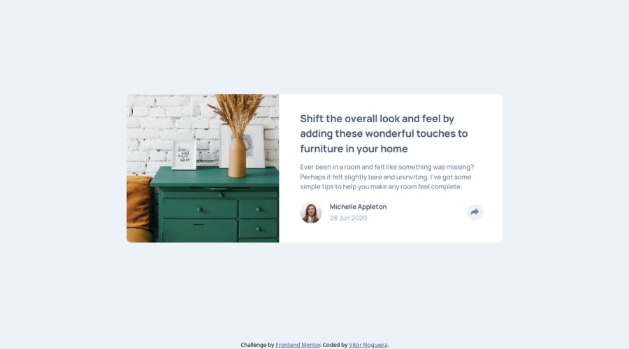
Article preview component solution
Design comparison
Solution retrospective
I'm proud of:
- doing the challenge;
- using the BEM, SMACSS, OOCSS methodologies in this project. It's the first time I used then so it took a long time for me to figure out some of the classes, but I did and liked how my HTML looked after XD;
- of doing a project with JavaScript alone, this really places in perspective how much you really know and can do without tutorials, etc. and I'm looking forward to improve my abilities in using it.
Next time I will look forward to use a preprocessor like Sass to help me organize my CSS better, specially with the use of BEM.
What challenges did you encounter, and how did you overcome them?- I got some problems with the image when testing for different screen sizes, but it was a problem with the height of the container and I overcame then by fixing it and using the aspect-ratio property in the wrapper of the image.
- Also got some problems with styling the share button icon color and the sizes of the SVG's in general, but I overcame these problems by using the aspect-ratio on the files and by putting the share button icon in the HTML instead of using the SVG of other file.
- I would like some tips on naming the classes and styling using BEM, SMACSS and OCSS. I used them, but I know there's a lot of room for improvement. Also I would like the same tips for namespaces, although I didn't use them here;
- JavaScript tips;
- Tips in general.
Community feedback
- @marliedevPosted 6 months ago
Overall a clean and well done solution! Code is structured well and readable.
What could be improved...maybe some tips, but as always it depends on the personal style and taste of developing also standards like BEM and SMACSS are quite useful (i use them too)
As the challenge title says: its a component. If you use the BEM Methodology, I personally prefer when naming the classes of the individual parts of a component that you can clearly see that they belong to the component
e. g. don't use "container" for a component; instead name it "article-preview"!
Thought ahead the different parts should be named "article-preview__image", "article-preview__content", "article-preview__share-button" ....
This way it's clear when scanning the code what belongs to what.
Another tip, when using "skins and themes": Don't combine different properties in one class
e.g.:
.text--dark-blue{
    color: var(--dark-grayish-blue);
    font-weight: var(--font-weight-bold);
    // what if you want a text to be dark blue but a light font-weight?
}
//better
.text--dark-blue{
    color: var(--dark-grayish-blue);
}
.font--bold{
   font-weight: var(--font-weight-bold);
}
Marked as helpful1
Please log in to post a comment
Log in with GitHubJoin our Discord community
Join thousands of Frontend Mentor community members taking the challenges, sharing resources, helping each other, and chatting about all things front-end!
Join our Discord
