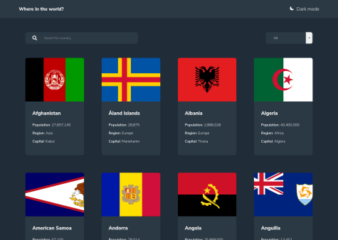
I appreciate any feedback. Not sure how to make the flag in the correct way. At beginning i thought that i will not be able to make it, but I thing that I did it quite well. In the other hand there are for sure a lot of things that could be done better.
Praneet Dixit
@PraneetDixitAll comments
- @filip65Submitted over 3 years ago@PraneetDixitPosted over 3 years ago
Hi!
Some points for improvement -
- I guess the body background color in light mode is not correct.
- You are sending a separate network request for every filter change. A better approach can be fetching all countries once on the initial page load, storing the data in a variable and performing all the filter operations on the stored data.
- There are many ways to manage the country flag. If you want to keep using the flag as a background image, you can change the background styling as below :-
/*** CSS ***/ .image{ background-size: contain; /* So that you don't end up cutting the flag */ background-position: top; /* Keeping the flag on top */ background-repeat: no-repeat; /* Don't repeat the background */ }- The icon and text in theme changer are misaligned.
/*** CSS ***/ .theme-toggle{ align-items: center; }- Set
cursor: pointeron clickable elements.
Some additional improvements (optional) -
- You can set pagination or infinite scrolling for long lists of countries.
- Allow users to directly visit country detail view by entering url in browser like
https://countries-search-api.netlify.app/detail/India.
Happy Coding!
0 - @blade-01Submitted over 3 years ago
Yay!!!🤾
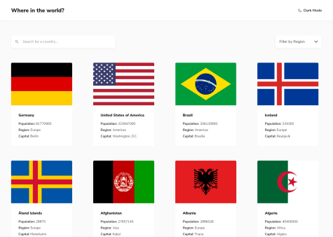
I'm so happy to be back, It's been a while I last completed a challenge, I believe there are easier ways to solving this challenge, I would be very much happy to receive feedbacks.
Arigatou 🤝
@PraneetDixitPosted over 3 years agoHi @Tobesh01 !
Good Job on the challenge !
Some points for improvement -
- There is no way to know which region have you selected once you click and select any region. It would be great if the name of the selected region is indicated in the place of "Filter by Region".
- I noticed that you are sending a separate request every time user is changing the filters. A better approach can be retrieving all the data only once on the initial page load, store it in a variable and do all the filtering operations on the stored data.
- The name filter and the region filter are not coordinating. When I type "ind" (without quotes) in the filter box and select the region Asia, I expect the app to show me all the countries in Asia whose name contain "ind". But both filters are overriding each other.
- Since there are many countries and each country card has an image, loading all those images can leave a bad effect on the UX. You can set
loading="lazy"on the images so that the off-screen images are not loaded until the user scrolls to them. You can read about lazy-loading here.
Happy coding!
Marked as helpful0 - @Samuca-sysSubmitted over 3 years ago@PraneetDixitPosted over 3 years ago
Hi. Nice solution.
Some things you can improve -
- The search filter and the region filter should coordinate with each other. For example, if I type "Ind" in the search-box and select region "Asia", then I should see all the countries in Asia whose name contain "ind". The filters in your current implementation override each other.
- Asia is missing in the region dropdown.
- You can provide an option to remove all filters.
Happy coding!
0 - @tkulicSubmitted over 3 years ago
Hello everyone!
This is my, Vanilla JS solution to this challenge. I decided to use another IP Geolocation API (IPWHOIS.IO), that doesn't require and API key.
I appreciate any feedback. Cheers!
@PraneetDixitPosted over 3 years agoHi!
Nice project, but there is a small issue.
Your page is served over
httpsbut you are requesting data from insecure resource (http), so the browser is blocking the request.Change
API_BASE_URLtohttps://ipwhois.app/json/Happy Coding!
0 - @prathyushSunnySubmitted over 3 years ago
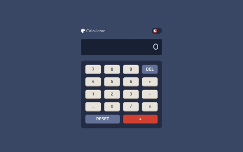
I have only implemented 2 themes though, sorry for that. I wasn't aware of traditional grid system so I had to use bootstrap grid system in order to layout the calc buttons. Anyways, please do check how I made the transition from Light <-> Dark (from calc.js line: 215) and suggest me if there's a rather easier or concise way to implement the same.
PS: I'm still in the learning stage, will be learning ReactJS soon.
@PraneetDixitPosted over 3 years agoHi!
Your theme switching implementation looks quite good.
Another way of theme switching is using custom properties and toggling a single class to change the properties.
Here is an example -
/*CSS*/

body{
  --text-color: #000;
  --background-color: #fff;
}

body.dark{
  --text-color: #fff;
  --background-color: #000;
}

.someElement{
  color: var(--text-color);
  background-color : var(---background-color);
}
//JS themeSwitchContainer.onclick = function() { document.body.classList.toggle('dark'); }You can play around with this to include more themes.
Your calculator is pretty functional.
+1 for keyboard inputs.
1 - @RyanCahelaSubmitted over 3 years ago
Does anyone know of a good method to keep the entire card from expanding and contracting when the questions are clicked and the answer is displayed without having the text overflow from its container?
@PraneetDixitPosted over 3 years agoHi. Nice project!
Some suggestions from my side :-
- The hero image is placed using pseudo element. Instead, you can place the image in the
hero-image-containeritself. - FAQs give you awesome chance to use
detailsandsummaryelements. Check this article by CSS Tricks - To prevent expanding and contracting of the card, you can have a question selected by default on the page load and collapse all other questions when the user selects another question. Check this pen
Happy Coding!
0 - The hero image is placed using pseudo element. Instead, you can place the image in the
- @tedikoSubmitted over 3 years ago
Hello👋!
Im surprised how much I learned from a seemingly easy challenge. I ran into problems with CORS on firefox and lost a lot of time trying to figure it out. Hopefully I found solution. List of things I learned or used creating this project:
- This is first time I used webpack. And more specifically I used
laravel mixwhich is a wrapper for webpack and targets the 80% usecase. I didn't realize how powerful tool it is. LINK - Implement an
environment variable(link) for my API_KEY. This is a variable whose value is set outside the program to secure our sensitive data. I did it with serverless Lambda function on netlify, so my API_KEY never shows up in my code and no one will steal it. Tutorial - This is first time I used
object literals(link) instead ofif statementin Tracker.changeContent function. Shortly, we have an object where the keys are the conditions and the values are the responses. Then we can use the square bracket notation to select the correct value of the object from the argument passed in. This looks clean and I will definitely continue to use this. - Added
aria-live="polite"andaria-atomic="true"to my.tracker__results-wrapperelement to expose dynamic content changes in a way that can be announced by assistive technologies after my results inner elements change content. - I didn't like that results container with address informations cover the map and user can't do anything with that. Added button to hide that container. More useful on mobile tho.
Errors that I encountered:
- The problem I talked about is only on Firefox. Console throws an CORS error ->
Cross-Origin Request Blocked: The Same Origin Policy disallows reading the remote resource. It turned out that after the recent firefox update you cannot fetch data between different origins. The fix is to send request to a proxy. A proxy acts as an intermediary between a client and server. The proxy server operates in between the frontend web app making the request, and the server that responds with data. Simply add https://cors.bridged.cc/ to any URL you’re fetching from or usecors-anywhere. Read about this CORS error. Since i work with serverless function on netlify i didn't have to put this in my fetch, because netlify fetching that data for me. But i think that info will be helpful for others. - Since we're using proxy, we have to somehow get user IP if we want to display user info on init. That is because geo api will return proxy ip address on default. I use cloudflare trace utility to work around this problem. It retunrs a plain-text set of key/value pairs.
Special thanks to @brasspetals for total help, @mattstuddert for helping with these CORS problems and @grace-snow for for throwing the link with object literals on slack. No specific questions here but any additional feedback will be appreciated! Thanks! 😁
@PraneetDixitPosted over 3 years agoI loved the hide details option. The details section hiding the map is very annoying in mobile phones.
1 - This is first time I used webpack. And more specifically I used


