


@Ruslan-oss-max0Submitted 17 days ago
Latest solutions
Product-preview-card-component
PSubmitted 17 days ago- Should I make my project pixel perfectly look like the figma desig? The size of elements and spaces are given in px in figma. Shlould I use this px parameters, or use more responsive ones, like em, rem, % etc.
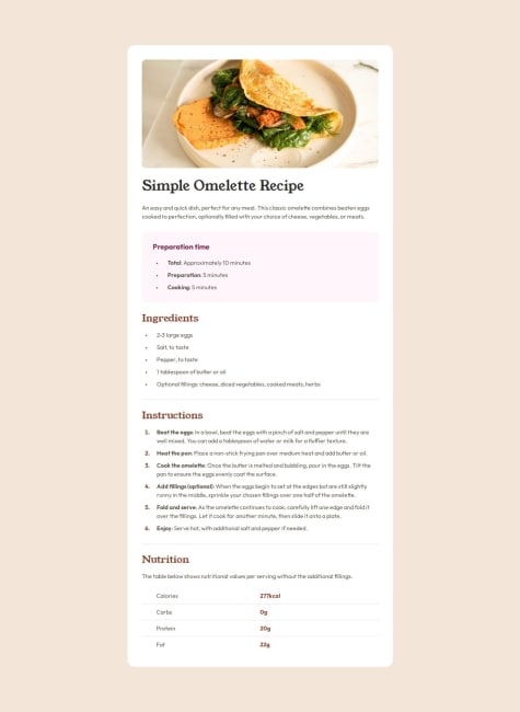
Responsive recipe page
PSubmitted 7 months ago-
In the "Instruction section" the numbers wont change to Outfit font family. I don't know why.
-
In inspection mode (FireFox developer edition) if I change the view to "Galaxy S20 Android 11" and "Galaxy S10/S10+ Android 11" there is a few pixel wide stripe at the right, and looks like the page is a bit wider than the screen. I don't know why.
-
Static social links profile
PSubmitted 7 months ago- Are my semantic tags good?
- Is that ok, if I give exact width and height to this panel, or should I only use responsive parameters?
Blog post review card with responsive CSS
PSubmitted 8 months ago-
How can I make the fonts responsive without media queries?
-
Is there any any system, that helps to make the CSS file look more organised? (for example margins first, font-size next etc.)
-
Latest comments
- P@L4r4TWPosted 17 days ago
Beautiful solution, and I like that you used responsive measures almost everywhere.
One mistake I realized - or maybe you made your solution with a reason on this way - you used 1400 px at your media query, so the card appears with mobile view on tablets and small resolution laptop screens too. A smaller breakpoint, around 768px will be better.
0 - @aguscorvoSubmitted 7 months agoWhat challenges did you encounter, and how did you overcome them?
Recipe image and padding in responsive view. I ended up using a div as a wrapper and media queries.
P@L4r4TWPosted 7 months agoIt's a pleasure to see a so perfect solution. The mobile view is also beautiful.
Making the image responsive was a huge pain for me to, I copy my mediaquery selection, hopefully it will show you something helpful:
/* Remove border radius on mobile screens */
@media (max-width: 768px) {
  /* Adjust the breakpoint as needed */
  .container {
    border-radius: 0; /* Remove border radius on mobile */
    margin: 0;
    padding-top: 0;
    /* box-sizing: content-box; */
  }

  .container img {
    border-radius: 0;
    width: 100vw;
    height: auto;
    margin-left: calc((-100vw + 100%) / 2);
  }
}
0 - @christianoller8Submitted 8 months agoP@L4r4TWPosted 7 months ago
Hi Christian! I love your solution😍
Here are some tips:
-
Try to use semantic HTML tags instead of <div>-s because ti makes your work more professional
-
The buttons in this project aren't real buttons, they are links that looks like buttons. Using links makes it much easyer to redirect to the given page, and if you hoover the cursor, it will automatically change to pointer, which is a small thing, but increases strongly the user experience.
Here is an example:
 <a
    href="https://linkedin.com"
    class="button-link"
    target="_blank"
    aria-label="Twitter"
>Twitter</a>
.button-link { display: flex; justify-content: center; align-items: center; /* Centers vertically */ width: 304px; height: 45px; margin-bottom: var(--spacing-lg); font-size: 16px; /* Set font size */ color: #fff; /* Text color */ background-color: var(--grey-700); /* Background color (blue) */ text-align: center; /* Center text inside button */ text-decoration: none; /* Remove underline */ border-radius: 8px; /* Rounded corners */ }- Hoovering over your buttons has a good looking color changing effect. You can make it better by changing the lenght of the effect:
.button-link{ transition: background-color 2s ease; /* Smooth color transition */ }- If you want to give a function that makes it able to use the arrow keys to navigate between the social media links you can use this small JavaScript code:
// script.js

document.addEventListener("keydown", function (event) {
  // List of buttons
  const buttons = document.querySelectorAll(".button-link");

  // Get the index of the currently focused button
  const focusedButtonIndex = Array.from(buttons).indexOf(
    document.activeElement
  );

  if (event.key === "ArrowDown") {
    // Move to the next button (down arrow key)
    const nextIndex = (focusedButtonIndex + 1) % buttons.length;
    buttons[nextIndex].focus();
    event.preventDefault(); // Prevent default behavior (scrolling, etc.)
  } else if (event.key === "ArrowUp") {
    // Move to the previous button (up arrow key)
    const prevIndex =
      (focusedButtonIndex - 1 + buttons.length) % buttons.length;
    buttons[prevIndex].focus();
    event.preventDefault(); // Prevent default behavior
  }
});
Hope I gave you some helpful information, not just bullshit☺️ and wish you a lot of fun with the future projects!!
0 -
- @Yessica-jsySubmitted 8 months agoP@L4r4TWPosted 8 months ago
Hi Yessica!
You made a pretty good looking card.
The only tip I can give you as a beginner is to avoid using style attributes in your HTML code, because it make the code messy. Put all style attributes into the CSS file.
Also consider using more whitespace between the elements, because easy to read content is vital in webdesign.
Keep up the good job! :)
0 - @MaddyDev007Submitted 8 months ago