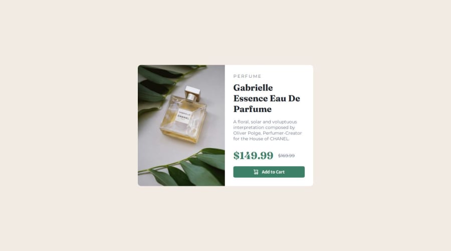
Design comparison
SolutionDesign
Community feedback
- P@L4r4TWPosted 19 days ago
Beautiful solution, and I like that you used responsive measures almost everywhere.
One mistake I realized - or maybe you made your solution with a reason on this way - you used 1400 px at your media query, so the card appears with mobile view on tablets and small resolution laptop screens too. A smaller breakpoint, around 768px will be better.
0
Please log in to post a comment
Log in with GitHubJoin our Discord community
Join thousands of Frontend Mentor community members taking the challenges, sharing resources, helping each other, and chatting about all things front-end!
Join our Discord
