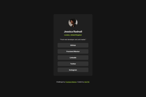
Submitted over 1 year agoA solution to the Social links profile challenge
Static social links profile
@L4r4TW

Solution retrospective
What are you most proud of, and what would you do differently next time?
- I start to understand how different elements connect to each other, and how can I place them to the right place.
-
Creating semantic tags is a bit problematic, but with YouTube and ChatGPT nothing is hard
-
Currently I dont know, how to make these lements totally responsive, but in the future project I will focus on this important topic
- Are my semantic tags good?
- Is that ok, if I give exact width and height to this panel, or should I only use responsive parameters?
Code
Loading...
Please log in to post a comment
Log in with GitHubCommunity feedback
No feedback yet. Be the first to give feedback on Bruno Banoczi-Cs's solution.
Join our Discord community
Join thousands of Frontend Mentor community members taking the challenges, sharing resources, helping each other, and chatting about all things front-end!
Join our Discord