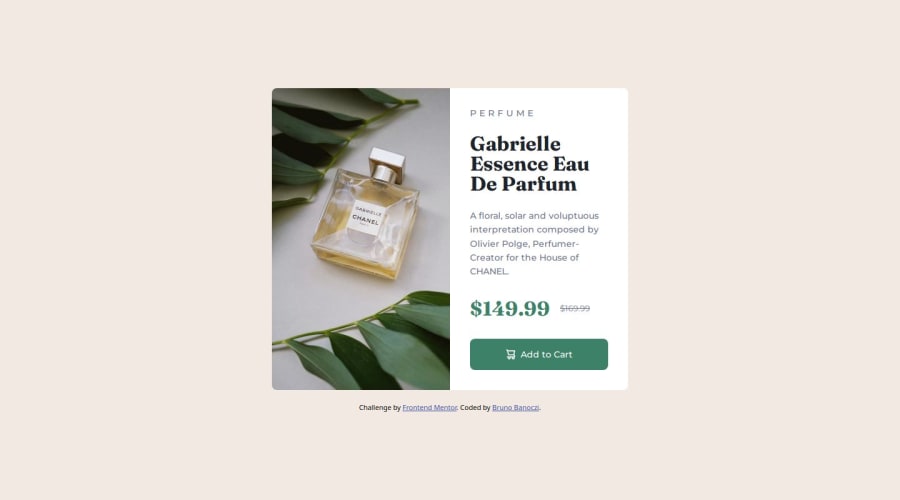
Design comparison
Solution retrospective
I'm most proud of the almost perfect looking design, and good responsivity. Next time maybe I should use more responsive properties instead of px, but using px makes it easier to create really similar design like in the figma file.
What challenges did you encounter, and how did you overcome them?Making the elements fit perfectly into phone screen was hard, but with chatGPT and StackOverflow, I figured out a pretty good solution.
What specific areas of your project would you like help with?- Should I make my project pixel perfectly look like the figma desig? The size of elements and spaces are given in px in figma. Shlould I use this px parameters, or use more responsive ones, like em, rem, % etc.
Community feedback
- @adonmez04Posted about 1 month ago
Hi, Bruno. That is a good question. You can use;
- the
remunit for thefont-size. - the
emunit for thepadding. - the
pxunit for themargin,border,radiusetc.
The point of using relative or absolute length units is that we want to know which element can or can't change its size. If we want users to be able to change the size of fonts, we can use the rem unit... On the other hand, if we don't want to change the size of the margin or the border radius, we can use the pixel unit. The em unit refers to the current element's font size, and most of the time it is very useful to use em for padding, but as a beginner you can use rem instead.
Marked as helpful1 - the
Please log in to post a comment
Log in with GitHubJoin our Discord community
Join thousands of Frontend Mentor community members taking the challenges, sharing resources, helping each other, and chatting about all things front-end!
Join our Discord
