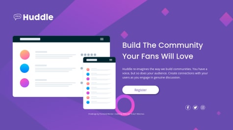
Would love hearing some small improvement tips to further make the website better. Thanks in advance! Really appreciate the feedback. Problem: When the screen max-width is around 900px, the page layout will become a 1 column layout. I think that this l1-column is not that great for that width because it makes the form too fat, would love hearing some other idea for this specific scenario
Kristian Dunne
@KristianDunneAll comments
- @NiteArieSubmitted almost 4 years ago@KristianDunnePosted almost 4 years ago
I like how you used the background-image property on your input fields to show the error icon! I might try this one my implementation. Overall it's pretty much a perfect match to the designs.
Great work!
3 - @dianailanSubmitted almost 4 years ago
Hi how can I make background pattern images to be responsive and become smaller with screen but don't change position relative to card?
@KristianDunnePosted almost 4 years agoHi Diana,
You need to set the bg-patterns as the bodys background through CSS instead of using them as HTML
imgelements. Check out how I did it here:https://github.com/KristianDunne/profile-card-component/blob/main/style.css
Hope this helps!
1 - @aymeric131Submitted almost 4 years ago
What i should improve in my code ?
@KristianDunnePosted almost 4 years agoI think markup is clean and concise. You could fix the spacing between the elements particularly in the footer and reduce the border width to closer match the design.
Besides that its nice and responsive, great work!
1 - @ImranAvengerSubmitted almost 4 years ago
Hi there, after more hardworking I may be successful. This project took a lot of time, anyway, finally, I'm so happy. ☺ And I've submitted it here, now it's the turn of you to judge it, and give me feedback, please! Thank you in advance.
@KristianDunnePosted almost 4 years agoIt works well on mobile and desktop however as the screen width starts to get better the content inside you
section_1div is fixed too far to the left of the screen. Besides that great work!1 - @deborahtrotaSubmitted almost 4 years ago
Any feedback or suggestions will be appreciated :)
@KristianDunnePosted almost 4 years agoYour site is not responsive on mobile or ultrawide views so it would be good to fix that next. It is also worth adding some padding to the social icons to give them some space from their borders to closer match the design. Keep up the work!
0 - @aaronpaulgzSubmitted almost 4 years ago
Any feedback is welcome :D Tried to did it quickly to discover if I had improved my skills :D
@KristianDunnePosted almost 4 years agoThe component is not centred on desktop and it needs some padding on mobile. Once you fix these I think it will be great!
0 - @daudi13Submitted almost 4 years ago
All feedbacks are welcome :-)
@KristianDunnePosted almost 4 years ago@daubi13 Your mobile implementation is great but I have a few suggestions that would improve the desktop version.
- Add more padding to your
boxes - Increase the font sizes
- Add a
max-widthto your.container-box - Increase
line-heighton your list items
You should also capitalize the sign up button label and remove its opacity when it is not being hovered over.
Keep up the good work!
0 - Add more padding to your
- @MarcusMourningSubmitted almost 4 years ago@KristianDunnePosted almost 4 years ago
Great implementation,
Just missing the bold text on the active accordion items title.
Nice work Marcus!
0 - @cyishereSubmitted almost 4 years ago
Any suggestion about how to deal with the filter buttons on the desktop or mobile?
@KristianDunnePosted almost 4 years agoNice implementation CY!
You should look at using styled-components or CSS modules alongside your components to have the styles scoped. Would be much nicer than having to go back to a global stylesheet.
Great work!
2 - @SirenaAlyceDevSubmitted almost 4 years ago
I could not figure out how to get the background image circles positioning correct. Can anyone help with that? I also noticed that some of my bootstrap classes and stylings aren't showing when deployed via Vercel. Can anyone help with that also?
@KristianDunnePosted almost 4 years agoHey @SirenaAlyceDev,
Because you installed bootstrap via npm you will have to tell vercel to install your node_modules.
Hope this helps.
1 - @lnirjarSubmitted almost 4 years ago@KristianDunnePosted almost 4 years ago
It looks nice and works well on mobile but the
card__bodygrows as the height of the page increases which is down to theflex-grow: 1.Maybe revisit this and check against larger screen sizes, but otherwise good work!
3 - @RenszCamachoSubmitted almost 4 years ago
Hi guys, this is my second challenge. I added some extra features and changed the design slightly. I'd like to hear your thoughts, what kinds of problems you find, and how you would approach them.
Cheers.
@KristianDunnePosted almost 4 years agoHey Rensz,
Looks good this and really like what you have done with the animations to add a bit of something extra to it.
Good work!
2


