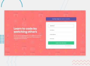
Intro Component with Signup Form with HTML, CSS and BEM
Design comparison
Solution retrospective
Would love hearing some small improvement tips to further make the website better. Thanks in advance! Really appreciate the feedback. Problem: When the screen max-width is around 900px, the page layout will become a 1 column layout. I think that this l1-column is not that great for that width because it makes the form too fat, would love hearing some other idea for this specific scenario
Community feedback
- @KristianDunnePosted almost 4 years ago
I like how you used the background-image property on your input fields to show the error icon! I might try this one my implementation. Overall it's pretty much a perfect match to the designs.
Great work!
3 - @emestabilloPosted almost 4 years ago
Hi @NiteArie, great job! You can apply
max-widthto your.containerclass to control the stretch for the 900px media query, just like you did with larger screens. For the error messages, my suggestion is to hide it withopacityorvisibilityinstead ofdisplay: none. Having these elements occupy space from the get-go would avoid the shifting that occurs when javascript inserts it. Hope this helps! :-)2@NiteAriePosted almost 4 years agoThank you for the feedback. I will test and see what I can improve^^
0
Please log in to post a comment
Log in with GitHubJoin our Discord community
Join thousands of Frontend Mentor community members taking the challenges, sharing resources, helping each other, and chatting about all things front-end!
Join our Discord
