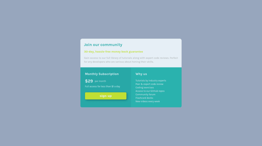
Design comparison
Solution retrospective
All feedbacks are welcome :-)
Community feedback
- @grace-snowPosted almost 4 years ago
Hi David
On mobile the top of the content is off screen for me and the attribution footer overlaps other content. Definitely address that if you can.
Usually the problem is explicit heights and/or absolute positioning, neither of which should be necessary for this solution.
Hope thats helpful
1@grace-snowPosted almost 4 years agoAlso. On mobile landscape all the text becomes centered, which looks a bit strange
0@daudi13Posted almost 4 years ago@grace-snow thank you let me take a look at those issues.
0 - @KristianDunnePosted almost 4 years ago
@daubi13 Your mobile implementation is great but I have a few suggestions that would improve the desktop version.
- Add more padding to your
boxes - Increase the font sizes
- Add a
max-widthto your.container-box - Increase
line-heighton your list items
You should also capitalize the sign up button label and remove its opacity when it is not being hovered over.
Keep up the good work!
0 - Add more padding to your
- @abhik-bPosted almost 4 years ago
Hey David 👋 ,Amazing job on this challenge !! Your solution is responsive and I liked your solution very much 👌👌
** Just a opinion : ** adding
cursor : pointerto "sign up" button can make the user experience a bit betterHappy Coding 😇 & Keep contributing these AMAZING solutions 🚀
0
Please log in to post a comment
Log in with GitHubJoin our Discord community
Join thousands of Frontend Mentor community members taking the challenges, sharing resources, helping each other, and chatting about all things front-end!
Join our Discord
