Julie Crotzer
@JCrotzerAll comments
- @olopcodesSubmitted about 1 year ago
- @davidmoreau2Submitted 6 months agoWhat are you most proud of, and what would you do differently next time?
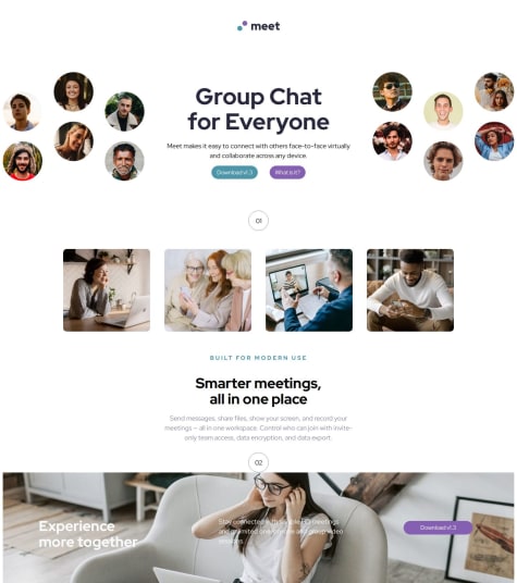
writing the css to get the image to look close. i still need to do the mobile and tablet sizing
What challenges did you encounter, and how did you overcome them?I need help figuring out how to get the hero images to slightly cut off on the page. and i cannot figure out how to do the lines above the number
What specific areas of your project would you like help with?I need help figuring out how to get the hero images to slightly cut off on the page. and i cannot figure out how to do the lines above the number
@JCrotzerPosted 6 months agoGreat job! The only thing I noticed is it is missing the blue transparent color over the bottom image. Try looking into using background- color with opacity. Otherwise, everything else looks good.
Marked as helpful0 - @mahbubit003Submitted 7 months ago
- @willengarciaSubmitted 6 months agoWhat are you most proud of, and what would you do differently next time?
Me orgulho de ter aprendido um pouco mais sobre grid, e juntar com o flexbox para deixar mais responsivo
What challenges did you encounter, and how did you overcome them?A utilização de grid
What specific areas of your project would you like help with?nenhuma
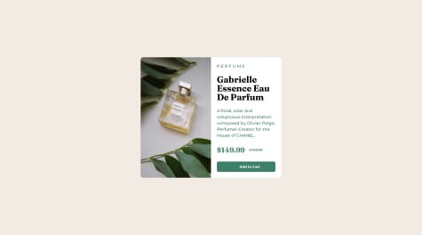
@JCrotzerPosted 6 months agoHello, Great job at completing this project! The only thing I can see is to make sure you have margins for the top and bottom, changing your background color and gap in the header. Try using the generate screenshot to help design your project to the solution.
0 - @ababaugSubmitted 7 months agoWhat are you most proud of, and what would you do differently next time?
I spend time learning css so that I can complete the project. I am happy I am able to complete it by implementing what I learnt.
What challenges did you encounter, and how did you overcome them?initially, I had problem with aligning the image for the desktop version with the text content. I then realised the way way to have it solved is to use it in a grid system. I also had issue with the cart icon, I couldn't align it with the text. I used span, then I used background image to put the icon side by side with the text.
What specific areas of your project would you like help with?nothing for now.
@JCrotzerPosted 7 months agoGreat job completing this project! The only advice I have is to use the generate screenshot to get as close to their design. Also, flexbox makes it easy to align items as well.
Marked as helpful0 - @anjabejicSubmitted 7 months agoWhat are you most proud of, and what would you do differently next time?
I'm most proud of the fact that when I got stuck, I didn't give up, I took a few days off the project, then came back and managed to see it differently and figured out a solution.
What challenges did you encounter, and how did you overcome them?Aligning everything and writing code in a way that's reusable so i don't have to write the same code over and over again. I gave myself more time to think about what I was doing.
What specific areas of your project would you like help with?Amongst a lot of other things...time management, writing clean code and aligning everything
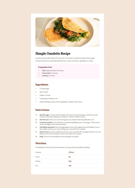
@JCrotzerPosted 7 months agoGreat job completing the Recipe Page project! It looks great. The only thing I see is some minor issues that don't match like border-radius and maybe the nutrition details needing a little more margin or padding on the left. Otherwise looks great!
0 - @luanbrendonSubmitted 7 months ago@JCrotzerPosted 7 months ago
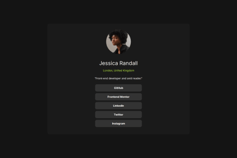
Hello, great job at completing this challenge. The only thing I can see is the width of your profile is too wide. Try changing the width and check your solution to their solution to see if it looks similar.
0 - @samrudhi222Submitted 7 months ago@JCrotzerPosted 7 months ago
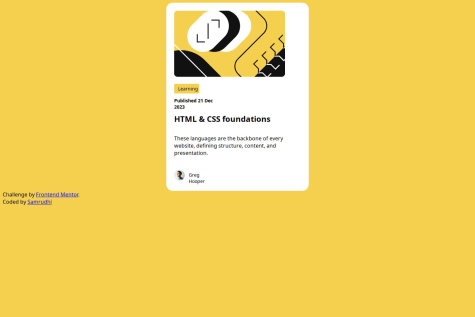
Hello, great job on completing this project! Just wanted to offer some feedback. Try using flexbox to center your card. It looks like the card is at the top of the page instead of centered. Flexbox can also help center your image and the name next to the picture on the card.
0 - @marcfrancissSubmitted about 1 year agoWhat are you most proud of, and what would you do differently next time?
.
What challenges did you encounter, and how did you overcome them?.
What specific areas of your project would you like help with?.
@JCrotzerPosted 7 months agoHey Marc, Great job on completing the qr-code-component. One of the things you can take advantage is to compare your solution to the design solution when you submit the project. It has been very helpful for me.
Marked as helpful0
