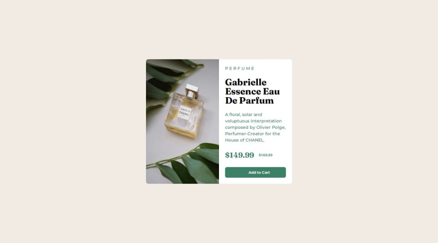
Design comparison
SolutionDesign
Solution retrospective
What are you most proud of, and what would you do differently next time?
I spend time learning css so that I can complete the project. I am happy I am able to complete it by implementing what I learnt.
What challenges did you encounter, and how did you overcome them?initially, I had problem with aligning the image for the desktop version with the text content. I then realised the way way to have it solved is to use it in a grid system. I also had issue with the cart icon, I couldn't align it with the text. I used span, then I used background image to put the icon side by side with the text.
What specific areas of your project would you like help with?nothing for now.
Community feedback
Please log in to post a comment
Log in with GitHubJoin our Discord community
Join thousands of Frontend Mentor community members taking the challenges, sharing resources, helping each other, and chatting about all things front-end!
Join our Discord
