Design comparison
SolutionDesign
Solution retrospective
What are you most proud of, and what would you do differently next time?
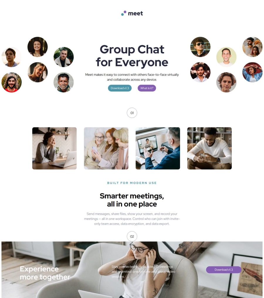
writing the css to get the image to look close. i still need to do the mobile and tablet sizing
What challenges did you encounter, and how did you overcome them?I need help figuring out how to get the hero images to slightly cut off on the page. and i cannot figure out how to do the lines above the number
What specific areas of your project would you like help with?I need help figuring out how to get the hero images to slightly cut off on the page. and i cannot figure out how to do the lines above the number
Community feedback
- @JCrotzerPosted 6 months ago
Great job! The only thing I noticed is it is missing the blue transparent color over the bottom image. Try looking into using background- color with opacity. Otherwise, everything else looks good.
Marked as helpful0
Please log in to post a comment
Log in with GitHubJoin our Discord community
Join thousands of Frontend Mentor community members taking the challenges, sharing resources, helping each other, and chatting about all things front-end!
Join our Discord
