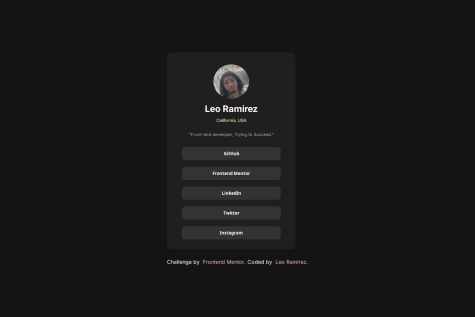
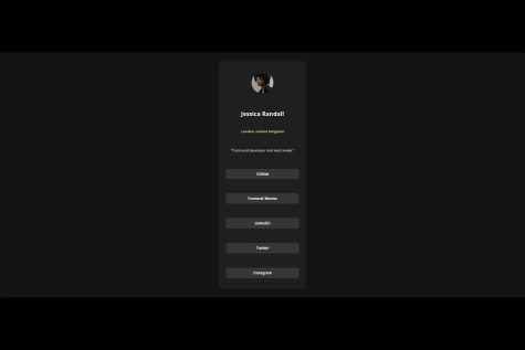
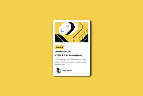
I’m proud of successfully implementing a clean and responsive layout using Flexbox. Next time, I’d focus on optimizing my code structure and improving accessibility features.
What challenges did you encounter, and how did you overcome them?A challenge I faced was aligning the card components correctly across different screen sizes. I overcame this by refining my Flexbox usage and adjusting spacing with CSS custom properties.
What specific areas of your project would you like help with?I’d appreciate feedback on improving my mobile-first workflow and making my CSS more efficient and scalable. Any tips on enhancing visual hierarchy and accessibility would also be valuable.


