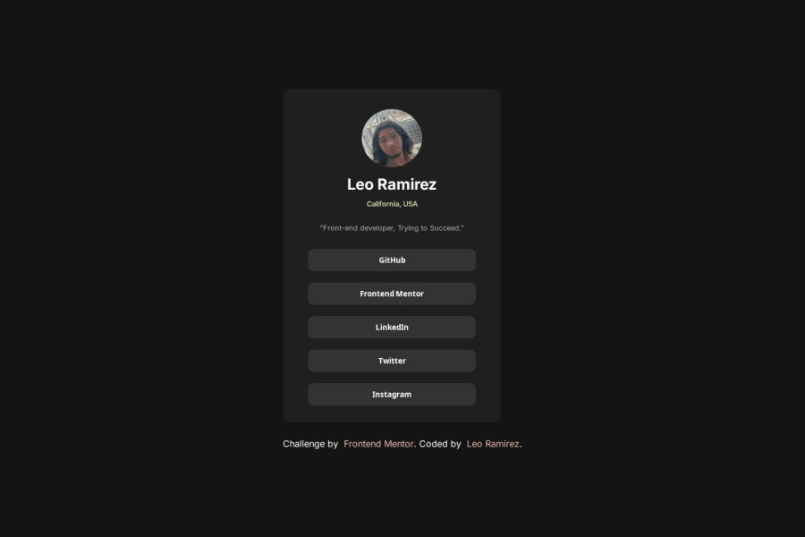
Design comparison
Solution retrospective
I am proud of how I structured my code. I structured everything layer by layer, and used every semantic tag I could. I believe my CSS structure wasn't too bad either but I do know I can make it more efficient with less used CSS classes.
What challenges did you encounter, and how did you overcome them?The biggest challenge for me was just getting started with the profile card. Once I had designed that into the rectangle I needed, the rest was very easy to add to it.
What specific areas of your project would you like help with?Responsive Web Design (RWD) is what I'd need help with. I tried adding a query to my code for bigger sized iphones but it's extremely basic and I wasn't very happy with it. Next time I plan on beginning my design phase on smaller screens, then I'll add the scale / additional functions the bigger the screen gets.
Please log in to post a comment
Log in with GitHubCommunity feedback
- @Tarps240
It look good to me, I would leave out the attribution in the final project. Also, you dont need to have the links in a separate "Links-container", if you plan on going further with web-development I would suggest getting used to camelCase words for code or at least not capitalizing your classes and Id's as this will confuse most coders and also JavaScript. Lastly, you didnt need to make your links into buttons. you could have just had:
<ul> <li><a href = "#" target = "_blank" class = "list-item">Instagram</a></li> </ul> and styled them that way. the button semantic can stand on its own outside the link element so you can use one or the other in the future. Great job though!
Join our Discord community
Join thousands of Frontend Mentor community members taking the challenges, sharing resources, helping each other, and chatting about all things front-end!
Join our Discord
