

Design comparison

Solution retrospective
I'm proud of my mobile first design. I used media queries to update the site for larger screens.
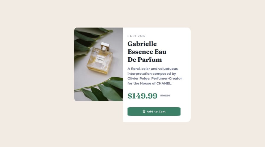
What challenges did you encounter, and how did you overcome them?The biggest issue I found in my code was the fact that I didn't implement the product image into the card container. The issue with that is my desktop design only looks good if your screen is at 786x px or larger, any weird size and the image looks misplaced. Next time I'll wrap everything in a logical container then format the content as it needs be.
What specific areas of your project would you like help with?I had issues formatting my text to look like provided screenshots. I changed the font and tried my best at the font-weight but it still looks off.
Please log in to post a comment
Log in with GitHubCommunity feedback
- @sbogee
Hi! First of all, it is better to use a separate .css file for your style for better readability. To have the correct format for your text, the font-weight for .Product-Details should be 500. Try to use pixels to set the border-radius. Your button would look better with border-radius set to 10px.

Join our Discord community
Join thousands of Frontend Mentor community members taking the challenges, sharing resources, helping each other, and chatting about all things front-end!
Join our Discord