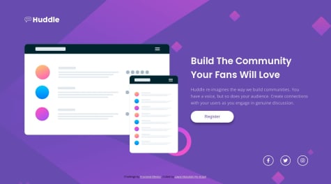
ZaiBerm• 50
@ZaiBerm
Submitted
I find the media query difficult.
what is the best practice when doing a webpage? is it better to define all html element first then design it or define a single html and design it then proceed to another element?
Looking to hire developers?
@Eyuleo
@ZaiBerm
Submitted
I find the media query difficult.
what is the best practice when doing a webpage? is it better to define all html element first then design it or define a single html and design it then proceed to another element?
@Eyuleo
Posted
Great work, to center the div both horizontally and vertically perfectly use either
body {
    min-height: 100vh;
    display: flex;
    justify-content: center;
    align-items: center;
}
or
body {
    min-height: 100vh;
    display: grid;
    place-items: center;
}
Marked as helpful
@OsmanSamar
Submitted
All feedback is welcome thank you.
@Eyuleo
Posted
Great and congrats on completing the challenge, but to center the card when using display: flex; instead of place-items: center; you can use
display: flex;
justify-content: center;
align-items: center;
and you don't have to set width: 100vw; on the body because by default it's taking the device entire width.
Marked as helpful
@NayanBramhane
Submitted
It was very difficult to find out how to center a containter along with its contents, but did with some help.
@Eyuleo
Posted
use relative units for font size em and rem more on this click here, by using this units you're allowing you're website to adapt to user's client font preference, overall, it's good. keep learning and improving.
Marked as helpful
@ManikMaity
Submitted
@Eyuleo
Posted
you can center it easily with grid or flex
body{
  min-height: 100vh;
  display: flex;
  justify-content: center;
  align-items: center;
}

or

body{
   min-height: 100vh;
   display: grid;
   place-content: center;
}
hope this helps.
@CharlyUrzagasti
Submitted
@Eyuleo
Posted
Instead of using margin to center the container use display flex and grid you can apply it this way.
body {
  min-height: 100vh;
  display: flex;
  justify-content: center;
  align-items: center;
}
or
body {
  min-height: 100vh;
  display: grid;
  place-content: center;
}
hope this helps.
great work on completing the challenge
@mero124
Submitted
@Eyuleo
Posted
to keep the .attribution class to the bottom of the page u can do these
.attribution {
   position: absolute;
   bottom: 0;
}
that way it doesn't appear on the middle of the page.
great work congratulation on completing the challenge, keep coding and improving.
Marked as helpful
@Tifana
Submitted
@Eyuleo
Posted
use relative units for font size em and rem by using this units you're allowing you're website to adapt to user's client font preference, overall, it's good. keep learning and improving.
@gabbyepelle
Submitted
This was harder than I thought it would be, especially placing the background images. Feedback greatly appreciated.
@Eyuleo
Posted
it's good but the attribution would be better if it was in footer tag because of accessibility reasons, to position the attribution to the bottom of the page instead of side by side with card you can set the flex direction for the main element to
main {
flex-direction: column;
}
that way you can fix the issue
congratulation on completing the challenge.
Marked as helpful
@Ay-shizzi
Submitted
@Eyuleo
Posted
A little suggestion the break point is a little to low it would be better if you make around 768px so that the content is responsive on mobile and tablet screen.
Congratulation on completing the challenge happy journey and learning.
Marked as helpful
@shalinialisha
Submitted
-What are the best practices that I missed? -How could I have organized my code better? -Is this the best way to center an element vertically and horizontally?
@Eyuleo
Posted
you can center the div using display grid or flex
body{
  min-height: 100vh;
  display: flex;
  justify-content: center;
  align-items: center;
}

or

body{
   min-height: 100vh;
   display: grid;
   place-content: center;
}
hope this helps.
@devjhex
Submitted
I used CSS grids for this one. I will be waiting for any suggestions available according to my code. Thanks
@Eyuleo
Posted
I think the break point on the media query is to high like it would be better around
@media (min-width:769px)
because the mobile version is visible on most screen even though the screen size is more than the typical mobile device screens. overall, it's really good happy coding all the best ✌.
@7deniz
Submitted
I have not finished the mobile version yet, I appreciate any comments. Thanks..
@Eyuleo
Posted
you can use display flex and grid to center the div like this
body{
  min-height: 100vh;
  display: flex;
  justify-content: center;
  align-items: center;
}

or

body{
   min-height: 100vh;
   display: grid;
   place-content: center;
}
don't repeat yourself if you're applying margin in all direction they will have the same value use shorthand for instance instead of
p{
  margin-left: 5rem;
  margin-bottom: 5rem;
  margin-top: 5rem;
  margin-right: 5rem;
}
use
p {
  margin: 5rem;
}
hope it's helpful happy coding
Marked as helpful
@lere22
Submitted
@Eyuleo
Posted
just a minor thing on small device screens add a margin on the body so that way the card is not sticking on the upper part. overall it's really good congratulation's on completing this challenge.
@nazimulhossain
Submitted
I want to know for centering an element which approach is better between absolute positioning and flexbox.
Thank You.
@Eyuleo
Posted
you don't need position absolute for the div, you can center it easily with grid or flex
body{
  min-height: 100vh;
  display: flex;
  justify-content: center;
  align-items: center;
}

or

body{
   min-height: 100vh;
   display: grid;
   place-content: center;
}
hope this helps.
Marked as helpful