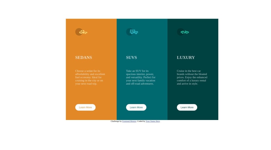
Design comparison
Solution retrospective
I have not finished the mobile version yet, I appreciate any comments. Thanks..
Community feedback
- @EyuleoPosted over 1 year ago
you can use display flex and grid to center the div like this
body{
  min-height: 100vh;
  display: flex;
  justify-content: center;
  align-items: center;
}

or

body{
   min-height: 100vh;
   display: grid;
   place-content: center;
}
don't repeat yourself if you're applying margin in all direction they will have the same value use shorthand for instance instead of
p{
  margin-left: 5rem;
  margin-bottom: 5rem;
  margin-top: 5rem;
  margin-right: 5rem;
}
use
p {
  margin: 5rem;
}
hope it's helpful happy coding
Marked as helpful0 - @Jack-WebDevPosted over 1 year ago
Hey 7deniz
Well done on finishing your project.
In this pull request I made a few changes.
Check out the recommendations I made for your HTML, mostly the naming On the CSS I noticed you didn't add any hover effects, so check out the recommendations on that too.
I hope you enjoyed this project and will continue to code. Feel free to ask for help ;)
Marked as helpful0@7denizPosted over 1 year ago@Jack-WebDev Thank you so much for your comments, as you understand I am a rookie. I am learning it with your bits of help. I am grateful. Best wishes...
0
Please log in to post a comment
Log in with GitHubJoin our Discord community
Join thousands of Frontend Mentor community members taking the challenges, sharing resources, helping each other, and chatting about all things front-end!
Join our Discord
