Catalin Banici
@CatalinBaniciAll comments
- @CarlosSimon02Submitted 10 months ago@CatalinBaniciPosted 10 months ago
Nice!
You could use a Loading Spinner when you select a country, instead of that simple Loading text in the top left corner.
And you can also add a Loading Spinner when you click on a Border Country. First time I clicked on a Border Country it took about 1 sec to fetch the data, there was nothing showing me that its processing, and I thought it was broken or something.
Marked as helpful1 - @visualdennissSubmitted over 1 year ago
This challenge was a nice project to practice state management of the whole app with Context API, storing all the data at the top level and retrieving it from grandchildren without prop drilling. Initial data is rendered dynamically from data.js
Step transitions are smooth with subtle fade-in animations. Clicking on plans or add-ons also produce some little ripple effect 🔥
Note: This was built some while ago, so with my current knowledge, i'm aware that the code needs some changes regarding best practices and some more improvements in terms of semantic HTML etc. Also the form validation is basic. (not checking for @ etc., type number for phone etc.)
@CatalinBaniciPosted over 1 year agoNice! With Context API seems legit! I also done this challenge and I was prop drilling the heck out of it. It was a mess 😅
1 - @FahatmahSubmitted almost 2 years ago
I find challenging in aligning the after element on p tag of active item when it is in a mobile view or size. Still now, can't think of any solution(❁´◡`❁)
@CatalinBaniciPosted almost 2 years agoFor the little orange dot, I basically added a <span> element in the <p> tag containing the other tags, and after the other tags inside that <span> I put a <i> tag with the font awesome icon fa-solid fa-circle, and dynamically that <span> element getting removed as onclick event. I did not use :after pseudo.
scroll to the right
 <li class="notification new-notification">
        <div>
          <a href="#"><img class="avatar" src="./assets/images/avatar-mark-webber.webp" alt="User Avatar"></a>
        </div>
        <div class="text-div">
          <p><a class="name" href="#">Mark Webber</a> reacted to your recent post <span class="link"><a href="#">My first tournament today!</a></span><span class="new-icon"><i class="fa-solid fa-circle"></i></span></p>
          <p>1m ago</p>
        </div>
      </li>
You can try replacing the :after with <i class='fa solid fa solid></i> and make it orange, I hope it helps
Marked as helpful0 - @CharlesSquirelSubmitted almost 2 years ago
I added button for marking as unread. In js with event delegation in order to exercise.
@CatalinBaniciPosted almost 2 years agoThat's really nice actually, after seeing this I might consider reworking on mine.
But don't forget to add the hover effects, I can only see one on mark as read/unread buttons, and there should be more.
Also try to add a function to remove the classlist for each notification, not only from the Mark All As Read button, as realistically , when you click on a individual notification, it should go on a read state.
0 - @yishak621Submitted almost 2 years ago
the process to the card design seems seasy at first but challenging in the process. questions
1-- the layout design in the atm card pictures adding overlay div block element was pretty challenging specially the responsiveness part...so what type of method is optimal to use for these type of things?
2-- the
input type='number'can not be limited the number of characters bymaxlengthandmaxattribute since it is not work for number type so i ended up using JS function for maxlength....so is there any other way?3- i use
border-imageproperty for a border with a linear gradient*when the input focused ...but i can't apply theborder-radiussince it can't go along with border image so how to fix these? beside these the input validation process was fun and at the same time pretty challenging i created several functions to check for each of them according to there input types and design. i use moment js library to validate date and month also add my function .@CatalinBaniciPosted almost 2 years agoUse this for the input border on focus:
input:focus {
  outline: none;
  padding: 15px;
  border: double 1px transparent;
  border-radius: 7px;
  background-image: linear-gradient(white, white),
    linear-gradient(to right, hsl(249, 99%, 64%), hsl(278, 94%, 30%));
  background-origin: border-box;
  background-clip: padding-box, border-box;
}
Not sure what it does or if everything is used in there.. but it works... for me at least. Try it
Marked as helpful0 - @andernaderSubmitted about 2 years ago
Hey how its going ,
So I finished this project and tryed my best with it but I am not sure about the usage of the html markup or semantics of this one. Did i use the right markup here? I would love to get anytips about that . thank you so much. ☺️
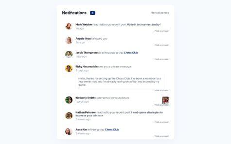
@CatalinBaniciPosted about 2 years agoYou should use an <ul> tag for the container and each notification inside an <li> tag. The avatars and every link should be in a empty anchor <a> tag, empty, because there is nothing behind them. The private message also should be in a different element tag, not sure which one, but in my solution I used <aside>, just to be different from the others.
edit: I just noticed, you did put the links in <a> tags, but you should also put the <img> tags from the avatars, usually you can click either on the user's avatar or user's name to see its profile in most cases, I guess...
Marked as helpful1


