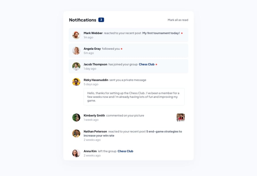
Notifications page solution - not sure about the sementics
Design comparison
Solution retrospective
Hey how its going ,
So I finished this project and tryed my best with it but I am not sure about the usage of the html markup or semantics of this one. Did i use the right markup here? I would love to get anytips about that . thank you so much. ☺️
Community feedback
- @CatalinBaniciPosted about 2 years ago
You should use an <ul> tag for the container and each notification inside an <li> tag. The avatars and every link should be in a empty anchor <a> tag, empty, because there is nothing behind them. The private message also should be in a different element tag, not sure which one, but in my solution I used <aside>, just to be different from the others.
edit: I just noticed, you did put the links in <a> tags, but you should also put the <img> tags from the avatars, usually you can click either on the user's avatar or user's name to see its profile in most cases, I guess...
Marked as helpful1
Please log in to post a comment
Log in with GitHubJoin our Discord community
Join thousands of Frontend Mentor community members taking the challenges, sharing resources, helping each other, and chatting about all things front-end!
Join our Discord
