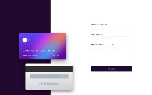
Interactive card details form solution

Solution retrospective
the process to the card design seems seasy at first but challenging in the process. questions
1-- the layout design in the atm card pictures adding overlay div block element was pretty challenging specially the responsiveness part...so what type of method is optimal to use for these type of things?
2-- the input type='number' can not be limited the number of characters by maxlength and max attribute since it is not work for number type so i ended up using JS function for maxlength....so is there any other way?
3- i use border-image property for a border with a linear gradient*when the input focused ...but i can't apply the border-radius since it can't go along with border image so how to fix these?
beside these the input validation process was fun and at the same time pretty challenging i created several functions to check for each of them according to there input types and design.
i use moment js library to validate date and month also add my function .
Please log in to post a comment
Log in with GitHubCommunity feedback
No feedback yet. Be the first to give feedback on yishak abrham's solution.
Join our Discord community
Join thousands of Frontend Mentor community members taking the challenges, sharing resources, helping each other, and chatting about all things front-end!
Join our Discord