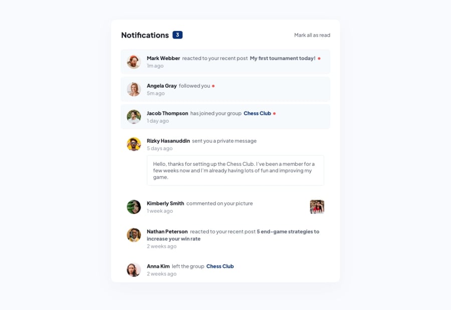
Design comparison
SolutionDesign
Solution retrospective
I find challenging in aligning the after element on p tag of active item when it is in a mobile view or size. Still now, can't think of any solution(❁´◡`❁)
Community feedback
- @CatalinBaniciPosted almost 2 years ago
For the little orange dot, I basically added a <span> element in the <p> tag containing the other tags, and after the other tags inside that <span> I put a <i> tag with the font awesome icon fa-solid fa-circle, and dynamically that <span> element getting removed as onclick event. I did not use :after pseudo.
scroll to the right
 <li class="notification new-notification">
        <div>
          <a href="#"><img class="avatar" src="./assets/images/avatar-mark-webber.webp" alt="User Avatar"></a>
        </div>
        <div class="text-div">
          <p><a class="name" href="#">Mark Webber</a> reacted to your recent post <span class="link"><a href="#">My first tournament today!</a></span><span class="new-icon"><i class="fa-solid fa-circle"></i></span></p>
          <p>1m ago</p>
        </div>
      </li>
You can try replacing the :after with <i class='fa solid fa solid></i> and make it orange, I hope it helps
Marked as helpful0
Please log in to post a comment
Log in with GitHubJoin our Discord community
Join thousands of Frontend Mentor community members taking the challenges, sharing resources, helping each other, and chatting about all things front-end!
Join our Discord
